Alquity Investment Management
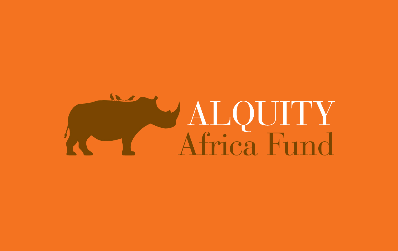
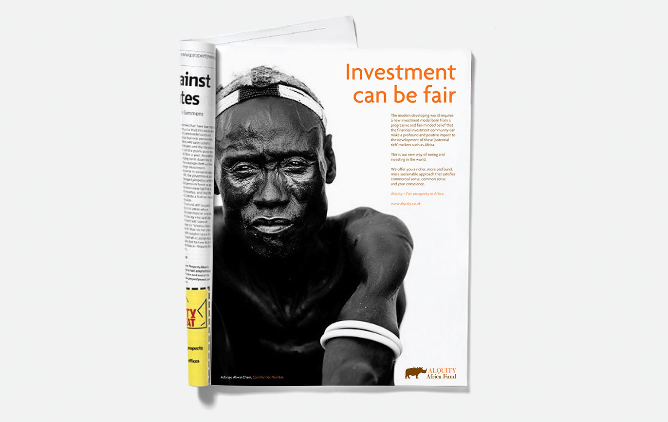
The first requirement was to create a brand strategy to be able to name the new venture. This led to the name Alquity, made from combining ‘Altruistic’ and ‘Equity’. From here we looked for a logo that would express the idea of a reciprocal relationship. Borrowing from nature in Africa, we chose the oxpecker perched on the back of a rhinoceros, happily having lunch while ridding its ride of pesky ticks, flies and other bugs.
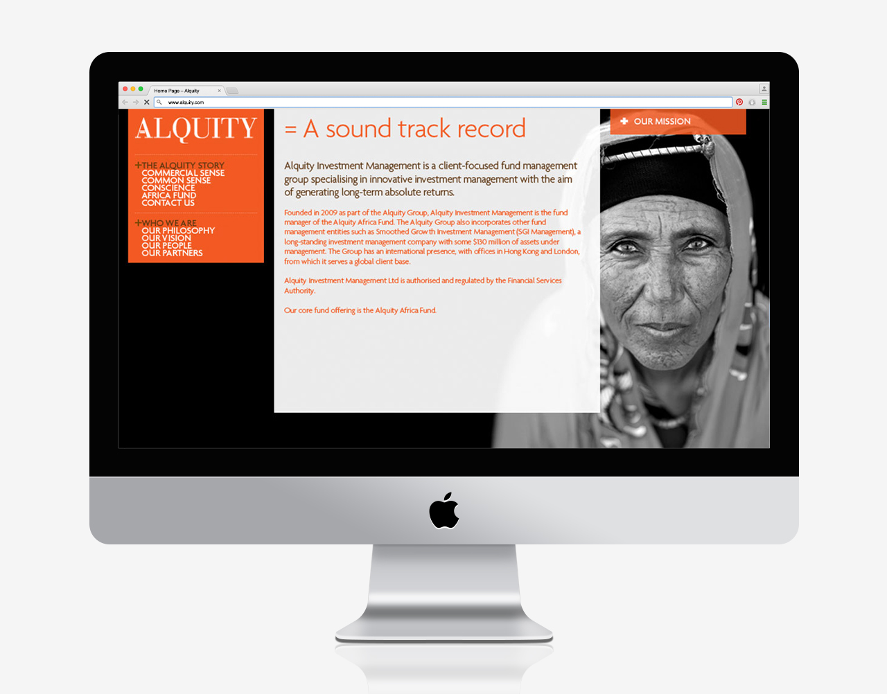
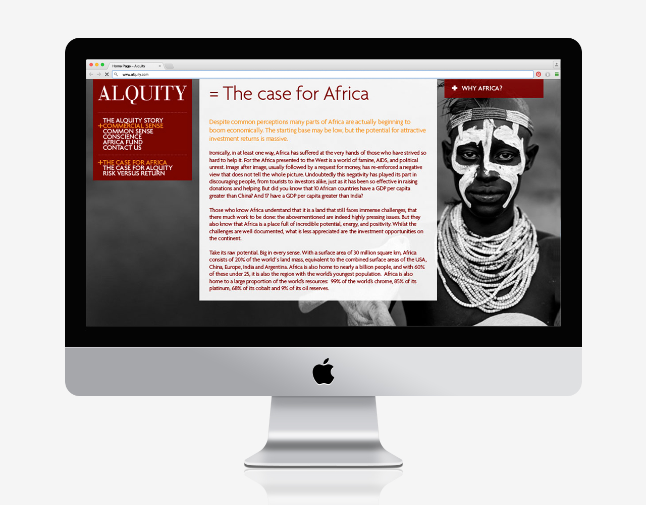
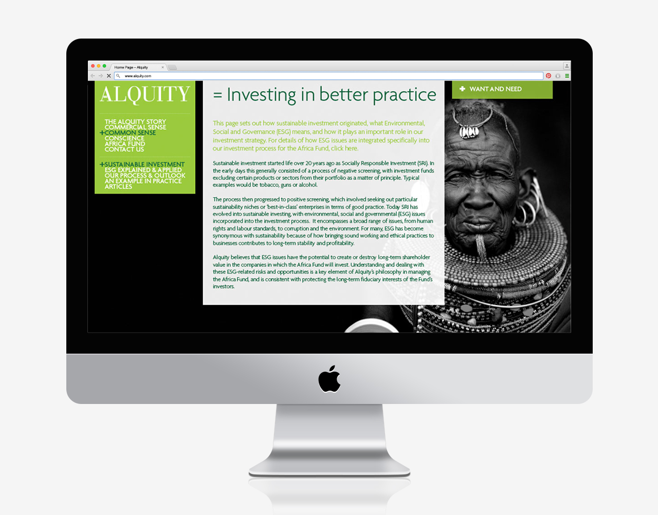
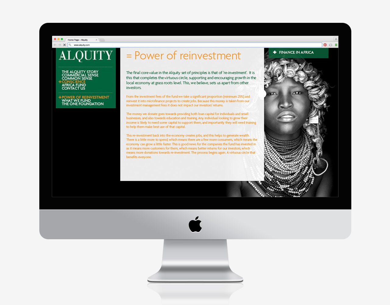
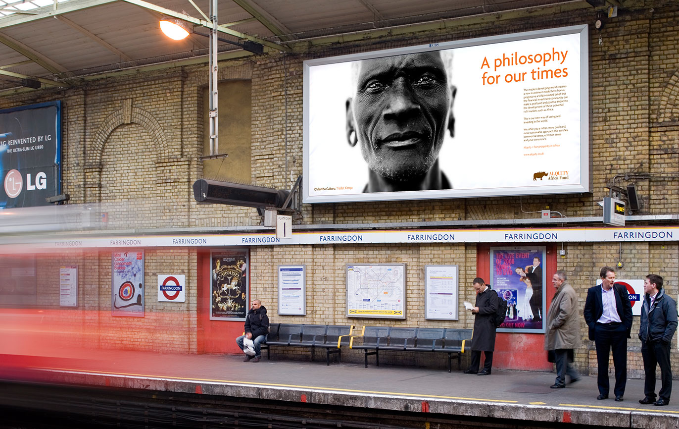
The website used very striking black and white portraits of African people who will be helped by Alquity’s re-investment into African micro-enterprises. These are real people with real stories to tell, which makes them all the more powerful. We combined this with very earthy African colours.
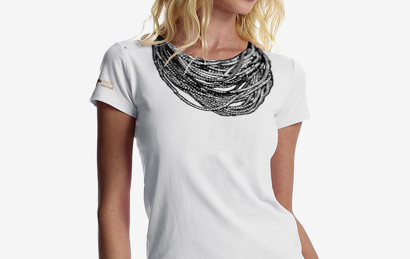
Their fund successfully launched with a bang, receiving excellent media interest from a launch event at which our branding was front and centre.
It is now an established player in the investment market.
- Brand identity
- Brand strategy
- Campaigns
- Literature
- Stationery
- Web design
