Lawn Tennis Association
After reviewing their logo, it was clear that there were a number of things wrong with it technically. Order of information, alignment and lack of modernity were all issues that we raised and showed them what we would do to evolve it. They were very happy to accommodate this.
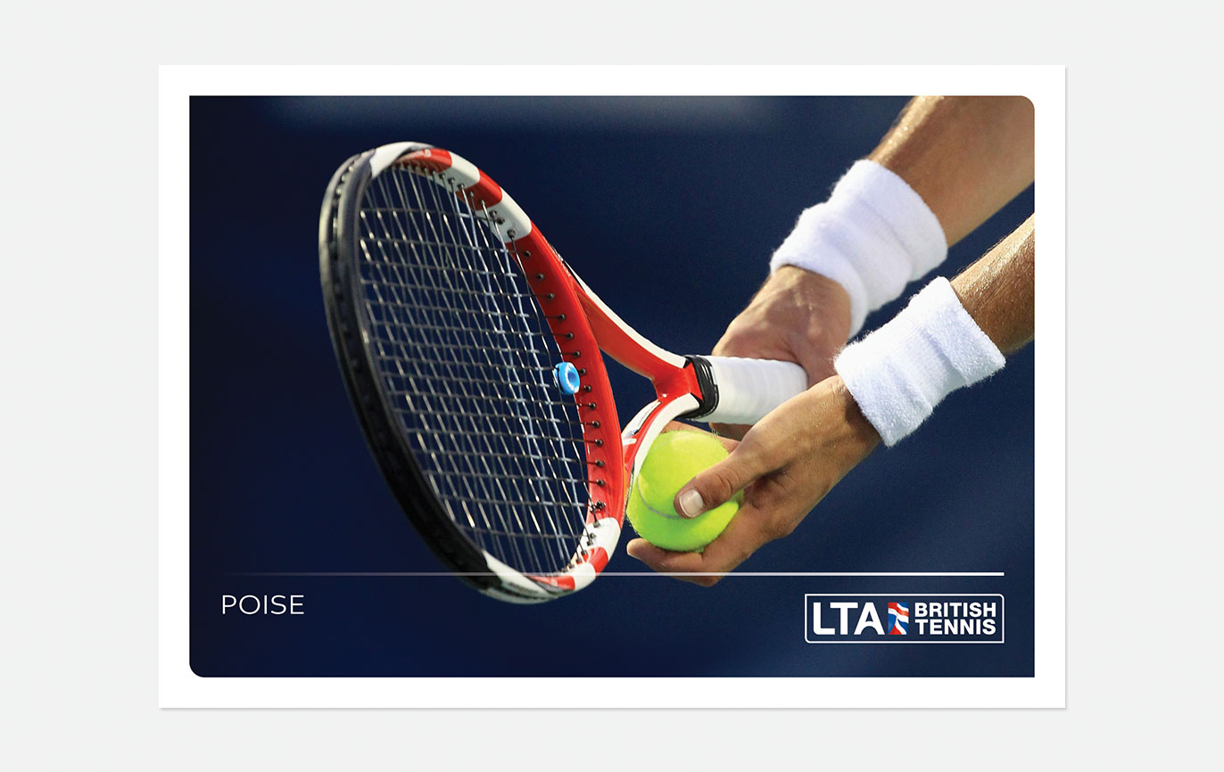
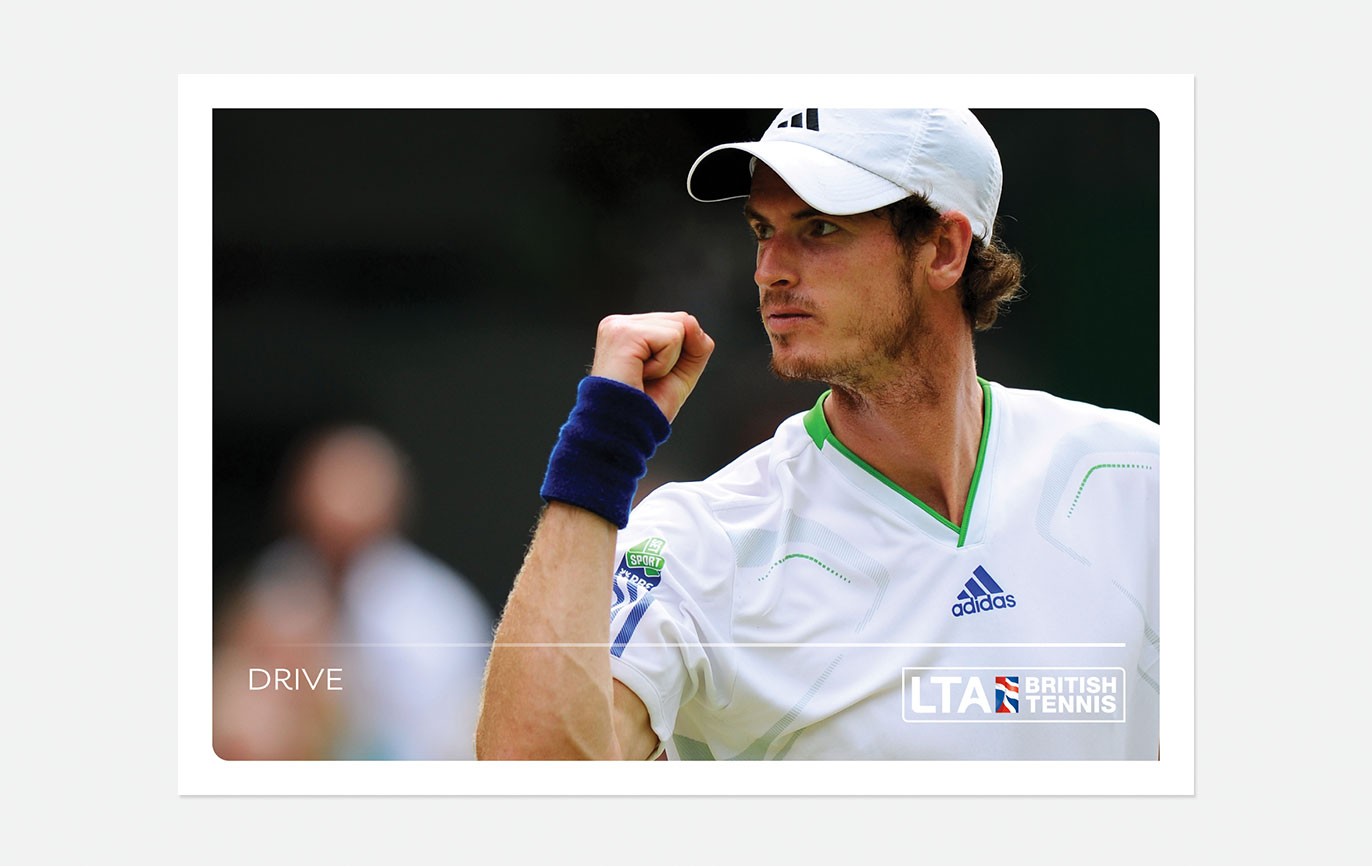
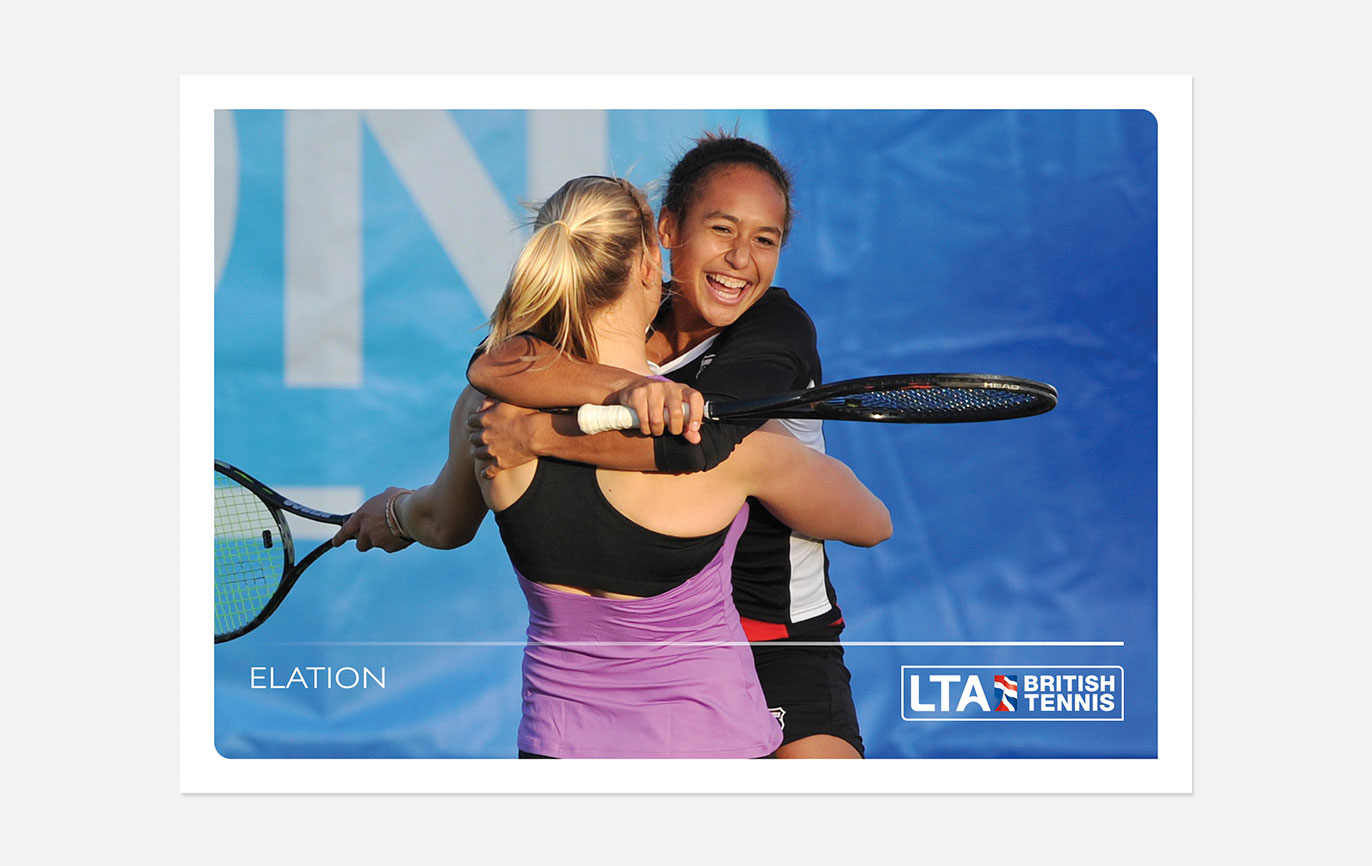
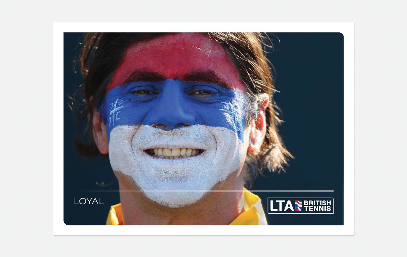
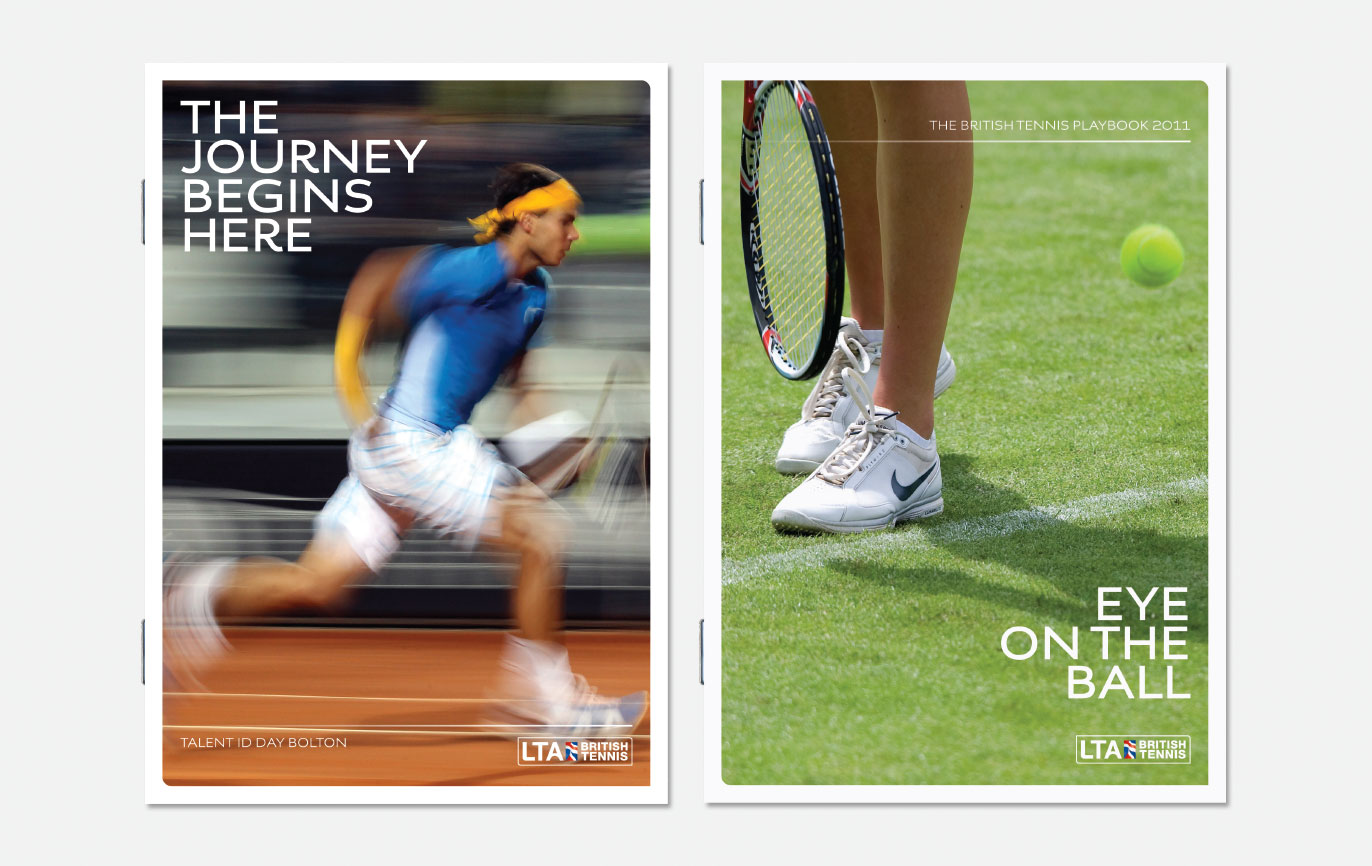
The new visual language uses dynamic photography which captures the energy and power of tennis, combined with engaging headings in a modern, flowing font, a set of tennis court-inspired colours and a line device which helps to structure information.
There is a lot of passion in tennis, both of players, but also of tennis fans. so passionate language is used. We also introduced a hierarchy of information to literature covers, whereby titles are emotive and subtitles are descriptive and functional in support.
- Brand identity
- Campaigns
- Event graphics
- Literature
- Powerpoint templates
- Promotional items
- Signage
- Stationery
- Word templates
