Insights
-
Five minutes with David Kimpton
Interview with Transform Magazine
David Kimpton is the founder of London-based Kimpton Creative. His design consultancy won big at the Transform Awards Europe 2022, scooping up two golds, a silver, a bronze, and the prestigious Grand prix award for its work with creative recruitment consultants Mustard. David explains his thinking behind the project and what its success means for his firm.
This whole project hinged on the idea that the creative recruitment industry has changed. How was that so, and why was Mustard’s brand therefore deemed insufficient?
Mustard had been 12 years or so in business and had noticed that the industry had just become so much more picky. It’s our nature as creatives to be picky I think anyway, but what [Mustard’s director, Ian Coulson] was saying was that the requests were just getting more and more extreme. So, for example, not only looking for somebody with packaging experience, but they also needed speak Italian as well. It’s about finding a good pool of people that have crossover skills, which is challenging. Inevitably it means that he’s got to find as many people as he can to be able to build this pool for himself.
And that was really where he was. He had a campaign and a brand image over a period of time that he felt had gotten a bit worn away. He’d done everything he could with it that was mustard related; pots of mustard and all the phrases that related to hot mustard and so on. He felt he had exhausted that and needed a new kind of impetus.
This idea of pickiness became a strong theme, and I could see what that meant as a designer because, of course, we’re designers. We knew our audience very well and that gave us a great opportunity, I think, to go a little bit off-piste because the other thing is that Ian, as a person, is quite different. He’s quite a character, he’s very personable and you don’t forget him in a hurry. To be given the opportunity to go off-piste – to position them outside of the normal mould of recruitment consultants – was just one of those ideal briefs you get as a designer.
How does that translate to the nuts and bolts of a branding project, such as the logotype, copy style and colour palette?
It started with mulling over how pickiness works and what that means as designers. Initially it started with the logo because we saw the word ‘must’ in the name mustard. We’d already been throwing around phrases that express the same sentiment that it’s an absolute must that people get recruitment right. From that, it led to other words almost like the Ten Commandments. You know, ‘thou shalt’, ‘you can’, ‘you must’ and so. We could see a kind of language there which I rather liked and that there was a power in those words.
I think with the colours we realised that it was important as a part of this brand to do something that was well crafted. This is partly because, as a designer, when you pick up a mailer on your desk it either feels like a leaflet and goes straight in the bin or it feels like something that’s beautifully crafted, has a sort of weight and texture to it and so it’s about how you interact with it. We felt that we wanted to go down that road and we pushed Ian to spend the money in crafting. He very much became part of the conversation about colours because he works with quite a lot of contemporary design agencies, and I think he wanted it to have a little bit of a surprising feel with an interesting combination of colours. That was nice for us to be able to explore.
The project was very provocative. Did you ever doubt the strategy along the way and how it would be received, given it was so bold?
Yes! We road tested it – which we don’t normally do – but because of the nature of our audience here, as in colleagues, associates, peers, we felt comfortable sharing it with some of our friends. We asked them some questions about it: “were they offensive or would you take it in the right way?” For instance, one of [the brand messages] said something like, ‘We love anal’. The idea was obviously that it draws you in and when you read on it immediately becomes clear that, when you refer to anal, you’re referring to being anal and the importance of concerning yourself with all the detail. It’s immediately clever in the sense that there’s a double meaning, but it’s also risqué in the sense that some people just think, “Oh, they’re just using rude words.” But most people responded very well to it and were relaxed with it.
Does it feel like your agency has now pushed onto another level following your work with Mustard and the feedback it received, not just from the client but from the creative community as well?
I hope so! I think it’s fair to say that that was a highlight of our Kimpton Creative career, a sort of moment in time that I think we can look back on, take pride in and trumpet because that is not an insubstantial achievement. I think recognition from marketing directors from the industry, as opposed to designer peers, is more important. The question then is, where does it take us? I guess time will tell what that does for us.
Do you feel the nature of branding projects is changing and calling for bolder, louder messaging? Or was the Mustard project a rather unique situation which called specifically for that approach?
I think they are. The whole sort of branding process has become more sophisticated than it used to be, which I think is brilliant. I find keeping it objective rather than subjective in the branding process is really important to me. Constructing the goalposts, if you will, means we’re pretty good at scoring the goals if we know where the goalposts are. I think that has become part of the process of defining what they’re about, then we have clarity. What I hate is scattergun. If a client says to me, “I don’t know what I want, but I’ll know it when I see it,” I would run a mile because, from experience, I just know that that’s a nightmare.
The power of what we do is to recommend several options that we know work. There are different nuances from each but they’re all going to work as far as we’re concerned. I think that boldness and power is certainly where we’re coming from and, as we’ve matured, perhaps we’ve seen more in our own thinking that this is right and to filter things down, to distil them down to something simple brings power to this message. I think that’s certainly what I see as a strength and I reckon good work is recognised for that, that you can sense there is a kind of consistency in application and a coherence in the message. With Mustard this is what you’ve got, isn’t it? It’s been narrowed down to a sort of single, bold style and there’s flexibility within that to communicate different things, but it’s a recognisable family. I think that is where we’re at with branding now.
Read more... -
David Kimpton on the importance of getting change right
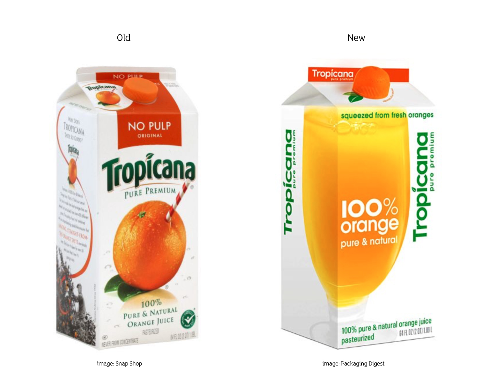
PepsiCo’s Tropicana packaging rebrand has been doing the rounds again on social media. And there are plenty of comments that follow, mostly to do with ‘if it ain’t broke…’ But there isn’t a single comment that nails the chief issue for me. Well, actually, to be fair, there is more than one issue, and not insignificant ones either.
Let’s start with the logo: a strong and recognisable logo has been trashed in favour of a completely different typeface in nature, as though there must have been a significant problem with the original. There wasn’t. Worse, it is positioned vertically up the pack, making it illegible at a glance. So brand recognition and loyalty was wildly abandoned. This resulted in a 20% drop in sales worth $30m in the first two months from launch.
But for me, the biggest mistake was removing the ‘idea’, which is so simple and direct. The orange with a straw in it. This for me is the equivalent of the Jif Lemon packaging. Distinctive and clever, it tells you what you want to know about the product. Pure orange juice straight from the fruit. Bang. Done. That’s the way to build a brand around a distinctive and clear message and that is what I spend my life trying to do for businesses and organisations – exactly the same.
The solution the agency replaced it with is a photograph of a glass of orange juice. Hmm. Does it have the cleverness of the straw in the orange? No. Does it have its originality? No. Therefore, does it have the distinctiveness to make it stand apart from it shelf competitors? No. Does it even communicate what you want it to? Not necessarily, no. That it’s orange juice yes: straight from the fruit? Not from the photo.
Comparing the old and the new side by side, the positive updates of the new pack were the vibrant colours that make your mouth water and the new orange shaped cap with the printed leaves, which is a nice touch. But these could have been applied as updates to the original pack design and they wouldn’t have thrown out the baby with the bathwater.
I don’t necessarily subscribe to the idea ‘if it ain’t broke…’ , as things that don’t change at all tend to stagnate and not reflect the times they live in. It’s not about not making changes, it’s about making the right changes.
I believe in the immediate. The clever. The distinct. The sweet spot is where these factors collide. That’s where success lies. And that’s what I search for. Try me.
Original post here: https://bit.ly/3NvjE3r
Read more... -
Property marketing in a changing environment
The commercial property market is facing big changes – BP last week announcing the sale of its head office in St James’s to scale down is a consequence of new working behaviours and, one suspects, the tip of the iceberg. There may well be an avalanche to follow. This is not to say that commercial offices are a thing of the past, it will no doubt just see a pattern of downscaling with partial home working and hot desking being very much the norm. This may mean there will be a lot of activity in the rental market once businesses have acknowledged and accepted a new way of working for their staff. While that may mean there are a lot of potential tenants out there, there may also be a lot of lettable property available. Therefore, the competition will once again be fierce to attract client attention.
Read more... -
Navigating the challenges of marketing an international business
It’s not easy being responsible for the marketing and communications of an international business. The more offices you have and the more countries you service, the more complex the nature of marketing and communications becomes.
This is partly to do with the issues of communicating across borders, but also simply the practical challenge of creating consistent and coherent communications from different offices.
Read more... -

Taking pride of place
I recently attended the ‘Creative Placemaking’ seminar, organised by New London Architecture, along with about 150 others. But why? And who were all these people? Among the speakers were City visionaries and number crunchers. There was ‘big picture’ perspective, as well as the ‘minutiae’. It quickly became apparent at the event that there are a lot of interested parties, many people with a stake in placemaking who also share a wish to transform a place for the better. This in itself struck a chord with me. It shows that an important ingredient in placemaking is collaboration. Given the many organisations involved in the process, it’s invaluable to allow for early stakeholder cooperation to help form early strategic approaches.
Read more... -

This Black Friday, why not Close the Doors?
Would you leave your front door open on a street from 9.30am to 6pm while you were inside all day? Many UK retailers seem to think this is a good idea to encourage customers to enter their stores, especially during today’s Black Friday sales.
After an excellent talk at Temple Group by Jeannie Dawkins, founder of the Close the Door campaign, I am one of the many supporters of this excellent and common sense initiative.
Read more... -

Cross-laminated timber
by Charlotte Christie
Cross-laminated timber (CLT) was a mystery to me until I attended a talk by David Lomax of Waugh Thistleton Architects at last month’s Vision London event for architects, clients and suppliers in Olympia.
David explained that CLT is an engineered-wood alternative to traditional timber where boards of wood are stacked at angles and glued together. It is strong, lightweight, versatile to use, cost-effective and offers thermal and fire resistant qualities.
Read more... -
You’re more than just a business… you’re a brand
Brand identity was a phrase much bandied about during the boom, as businesses and products competed to stand out in crowded markets. But the benefits of a defined persona, with clearly stated principles and aspirations, have weathered the change in economic fortunes, and infiltrated the architectural profession. The payoffs might be greater than you think.
Read more... -
Can placemaking define the identity of a place?
Recently I was fortunate enough to see first hand what Grosvenor has been doing to improve Mayfair. As well as major refurbishments to some of their Georgian properties and new premium retail in Duke Street, they have introduced a number of community-based initiatives, such as a film festival, ‘Fitness in the Gardens’, bee-keeping, ‘Summer in the Square’ and pop-up green spaces. There is also an Anthony Gormley sculpture as a part of the new Beaumont Hotel.
Read more... -
Communicating the value of wellbeing
In the property sector, the concept of wellbeing is on the agenda. It’s not a new idea, but it is coming to the forefront for developers when considering how to position and sell their property.
So why is this? I spoke to Jin Cui (Tishman Speyer), Robert Delius (Stride Treglown), Mike Hussey (Almacantar) and Luke Schuberth (Aukett Swanke) to find out.
Read more...