Ayming
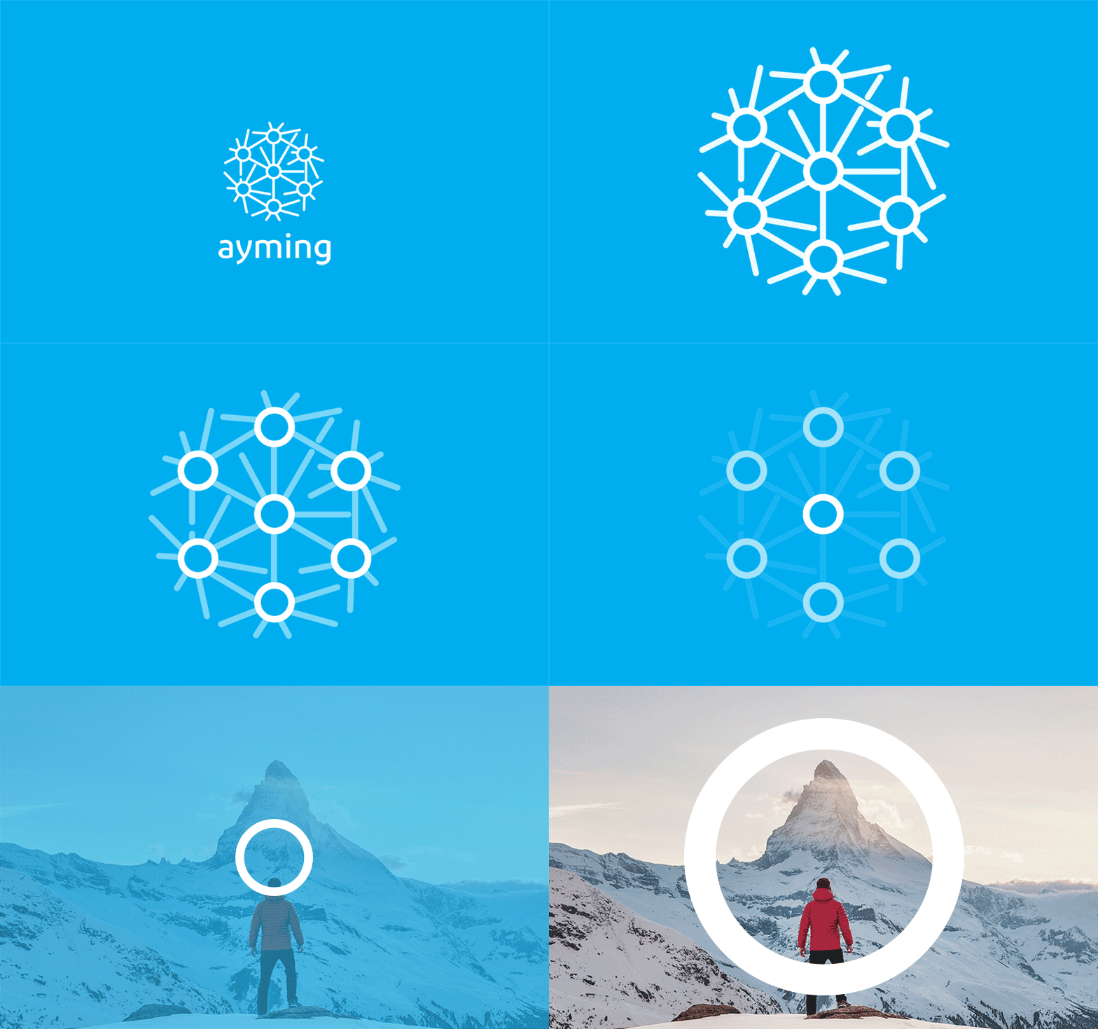
We were told that they were keen to retain their logo (only two years old after the merger of two businesses), but refresh everything else! Initially we thought that was a shame, but in fact we managed to unite the logo with the concept, something that was lacking before.
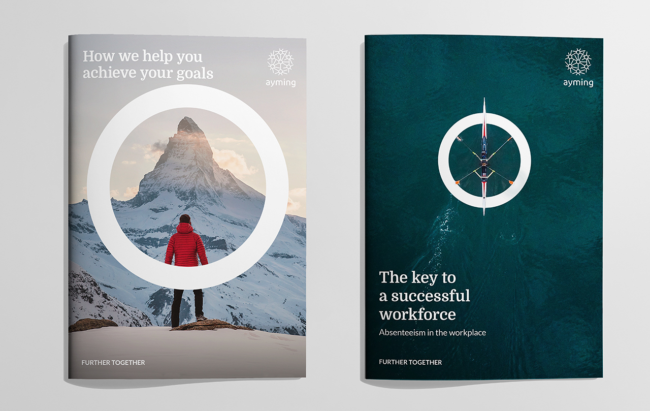
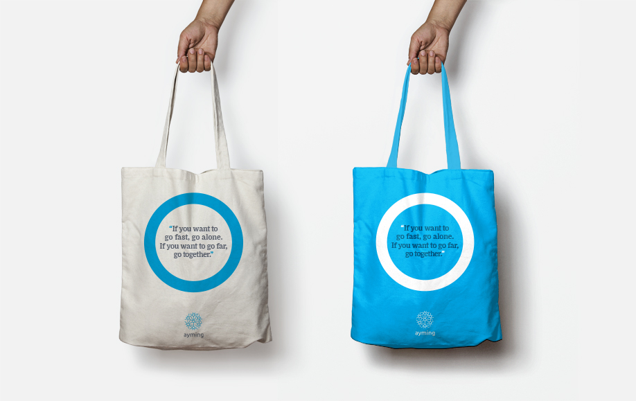
To begin the project, we led a strategy workshop with key stakeholders within the business. From this we created their internal mantra, their core proposition: ‘Empower people to aim further together’. We also created an external strapline ‘Further together’, which expresses their culture and approach to working collaboratively with their clients.
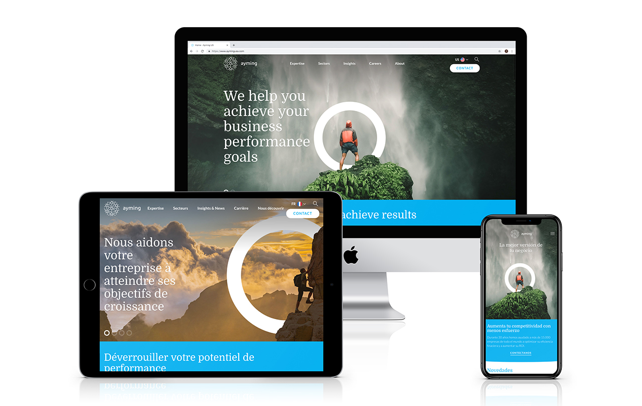
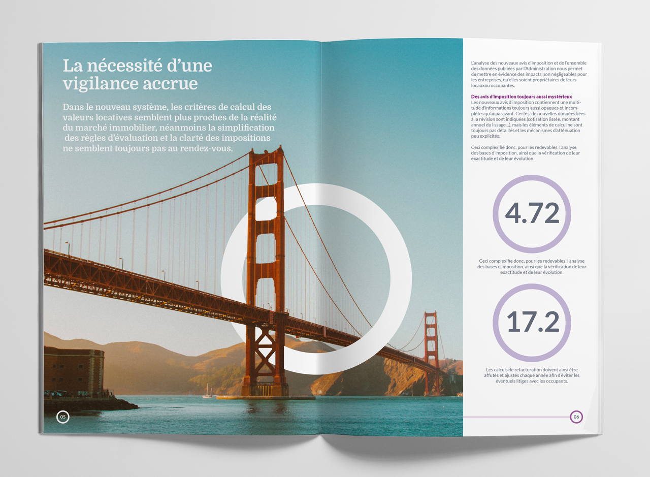
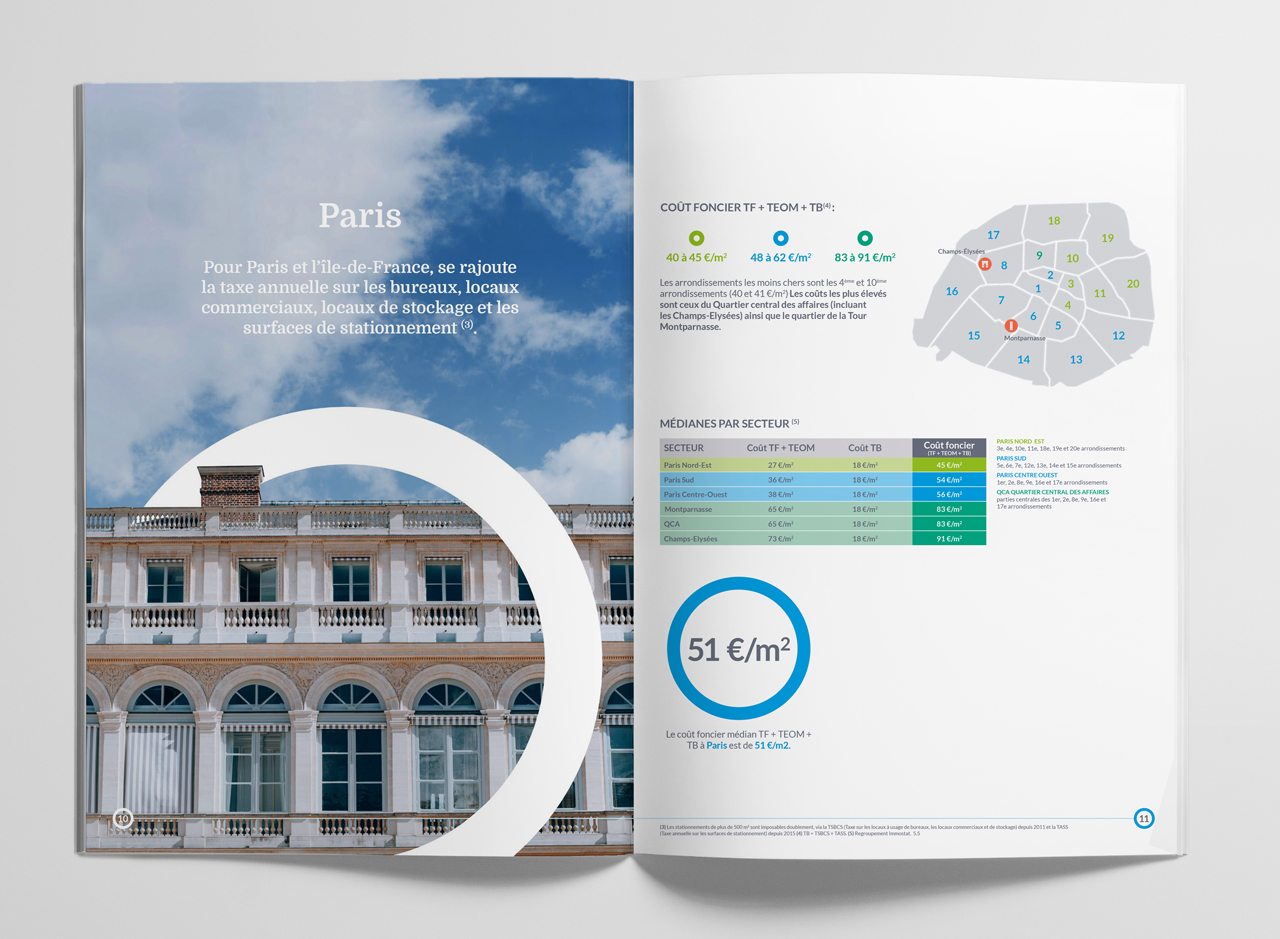
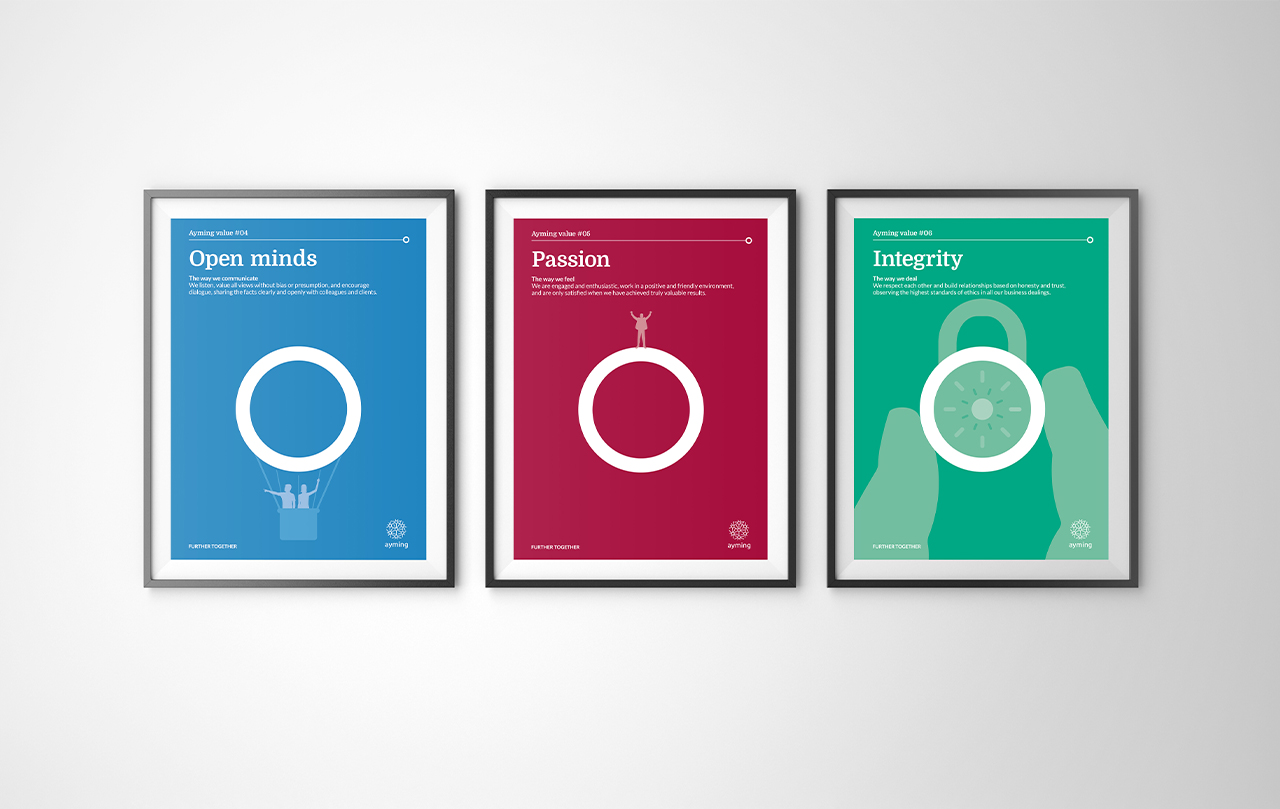
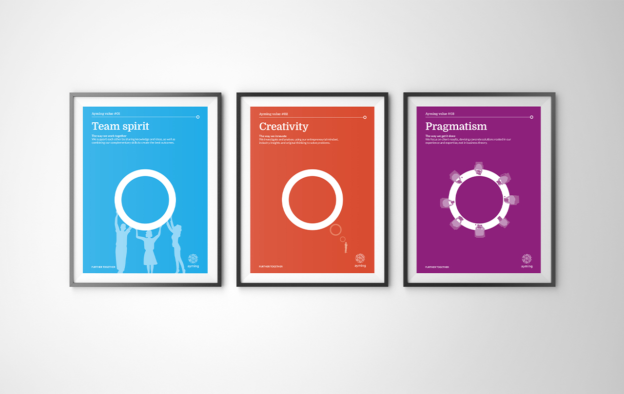
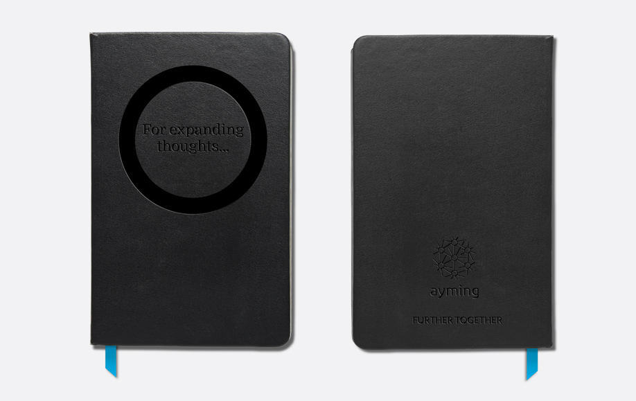
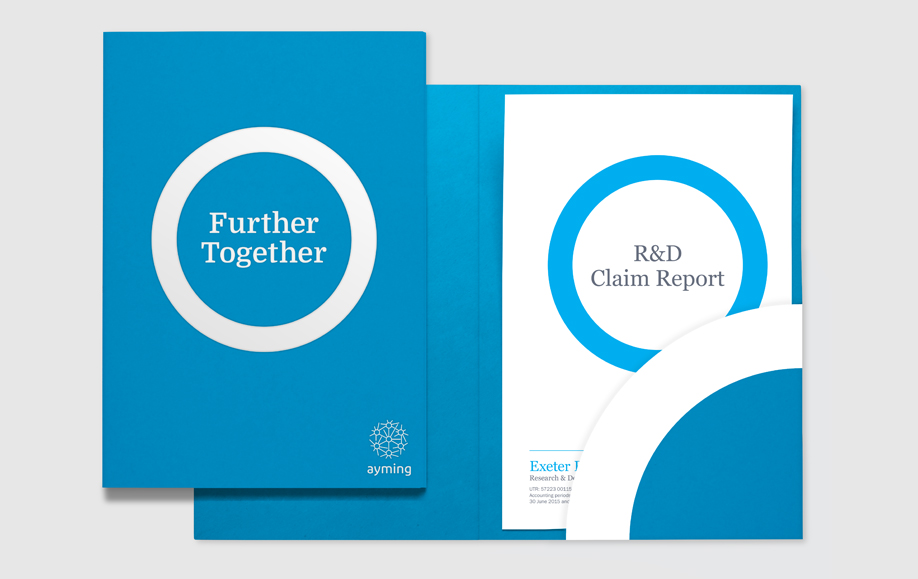
We brought this to life by using the circle, inherent in their logo, to perform a variety of roles. This works most notably on imagery where the circle selects or highlights elements within the image to define a destination. The imagery we chose represents the journey Ayming and their clients go on – many of their clients have aspirations to push boundaries and create change in their world, which is why journeying across epic landscapes felt appropriate.
Ayming’s President, Hervé Amar, was very clear that Ayming is different to typical management consultants – there is a lot more working at the coalface alongside their clients – and as a result the chosen concept ticked the box of being distinct and nothing like their competitors.
Whilst creating their guidelines and templates and introducing them into the International MarComs team, we’ve also designed materials for some of their current key initiatives, such as their annually held Business Performance Awards, hosted in Paris in front of some of the world’s leading business leaders, with key speakers such as Tony Blair previously attending.
- Brand identity
- Brand strategy
- Campaigns
- Event graphics
- Literature
- Powerpoint templates
- Social media
- Stationery
- Video
- Web design
- Word templates
-
15%increase in revenue
compared to previous year -
300%increase in new business
leads since rebrand -
350%increase in applications
via the new website
-
15%increase in revenue
compared to previous year -
300%increase in new business
leads since rebrand -
350%increase in applications
via the new website
