Bankside 123 marketing suite
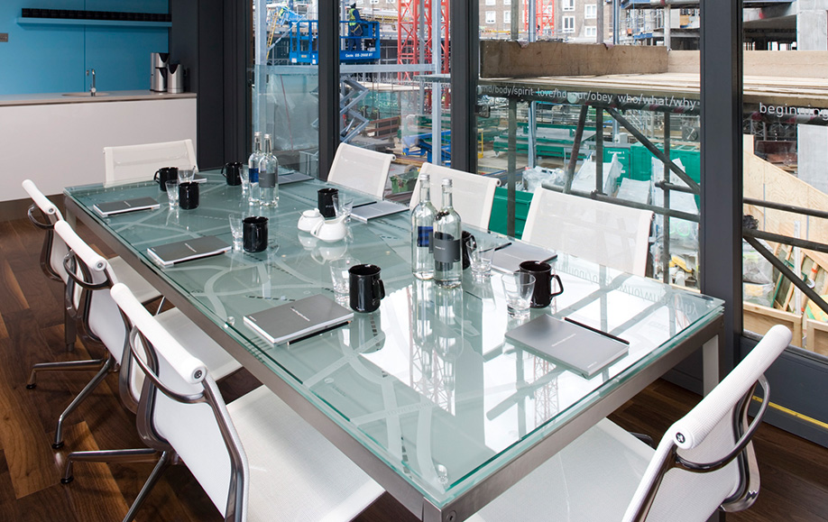
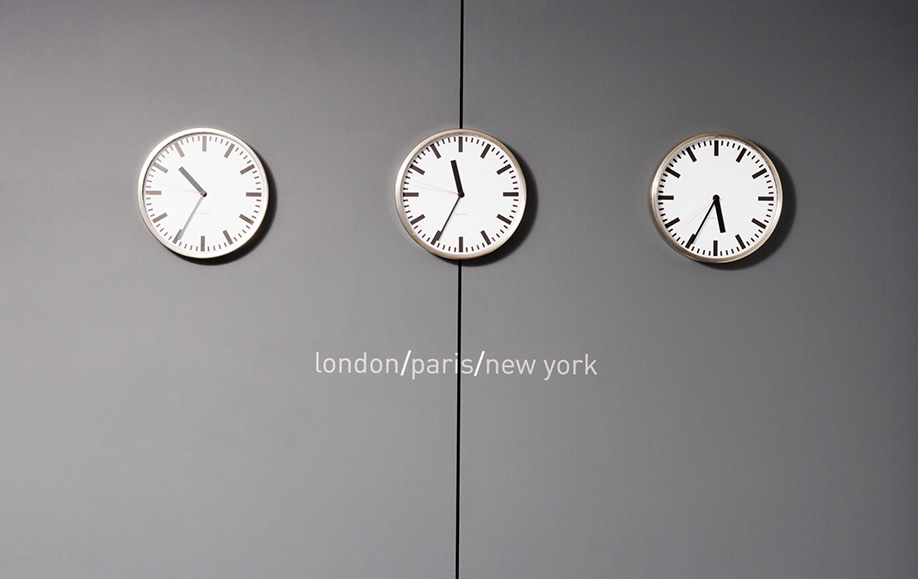
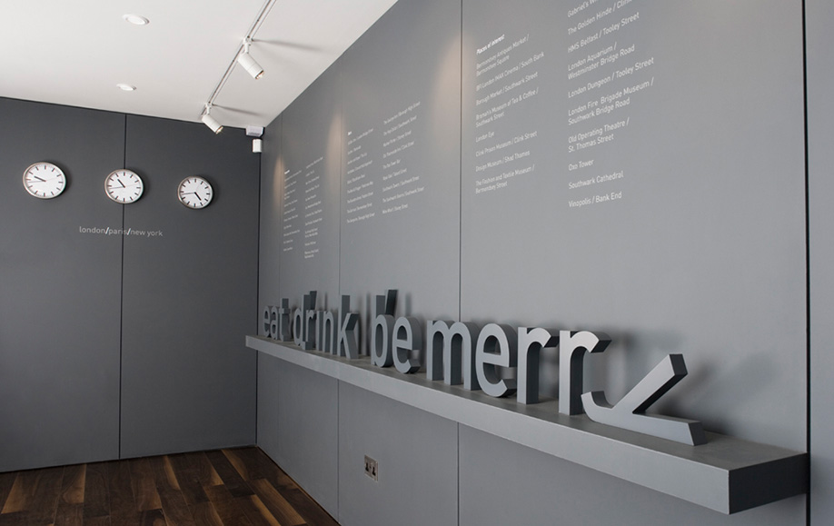
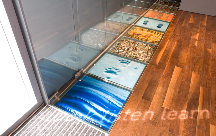
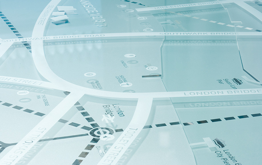
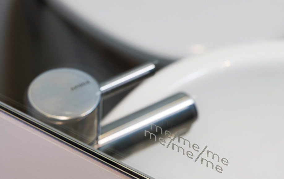
The interior graphics followed the ‘123’ idea with a series of three word phrases to support the selling points. These were mostly vinyl—a cost-effective, temporary solution. The meeting table had three layers of glass, each highlighting transport, amenities and places of interest on a map.
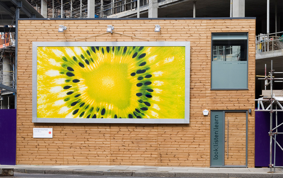
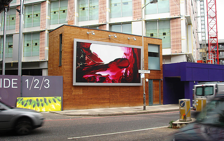
Outside, facing the road, we designed a giant poster format that featured local photographers’ work of nearby places, such as Borough Market. The area is full of cultural wonders. This was updated on a regular basis.
The office spaces were successfully pre-let in three months and we went on to produce marketing promotions for the retail spaces.
Read more...
- Marketing suite
- Promotional items
- Signage
-
100%pre let
-
100%pre let
