BKL
We helped to define their brand strategy, which centred around the core proposition and existing BKL value of ‘Making a difference’. This might be to their clients, to the business, to their careers, to their community.
From this base, we crafted a set of words that concludes with BKL. Build Bright. This means that BKL builds bright ideas, bright relationships and bright futures.
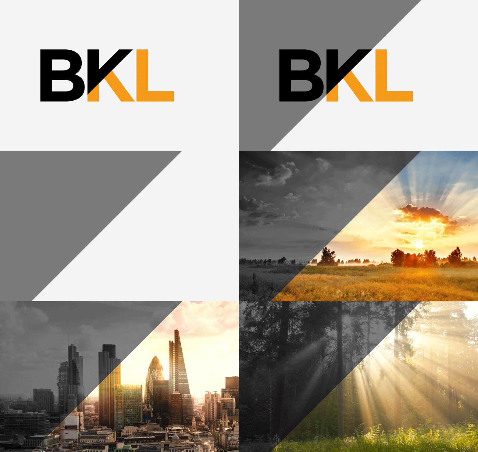
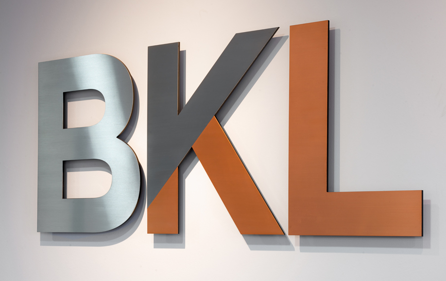
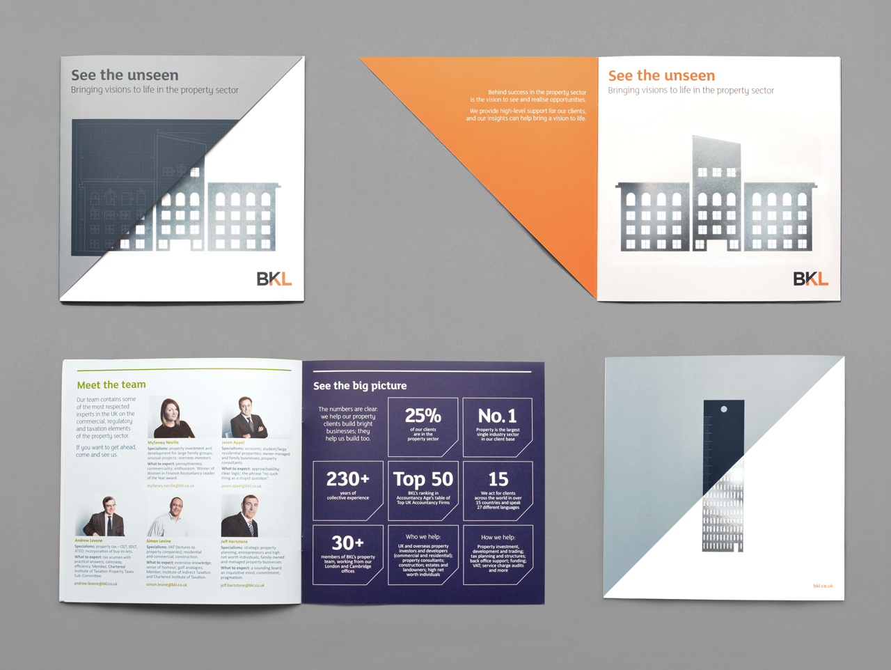
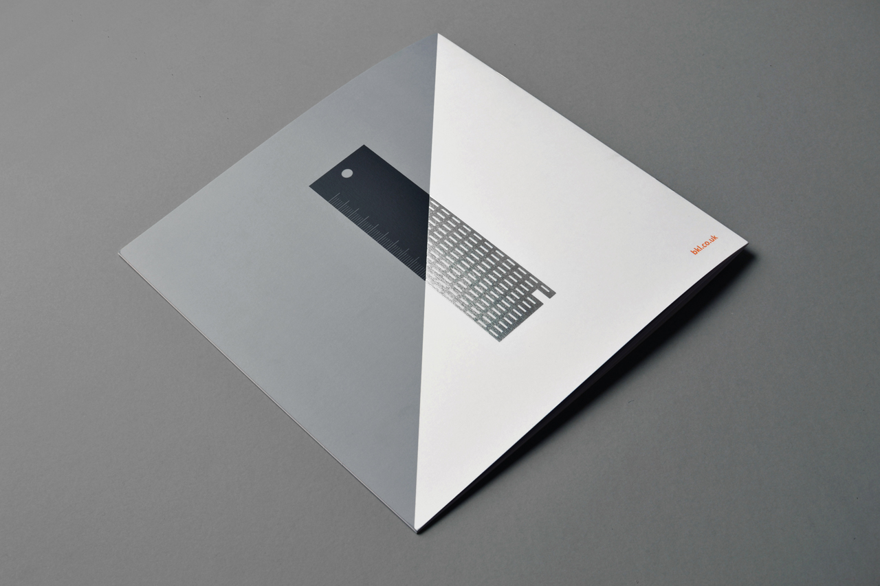
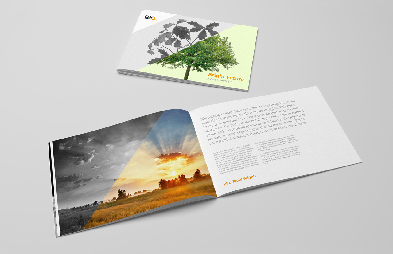
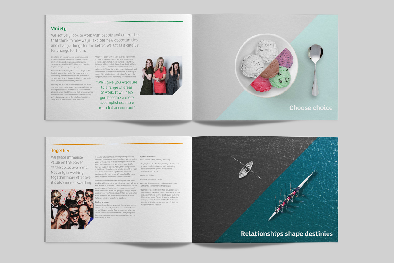
This is reflected in a visual identity that uses an angle in the logo to divide what is untouched by BKL and what is inspired by BKL.
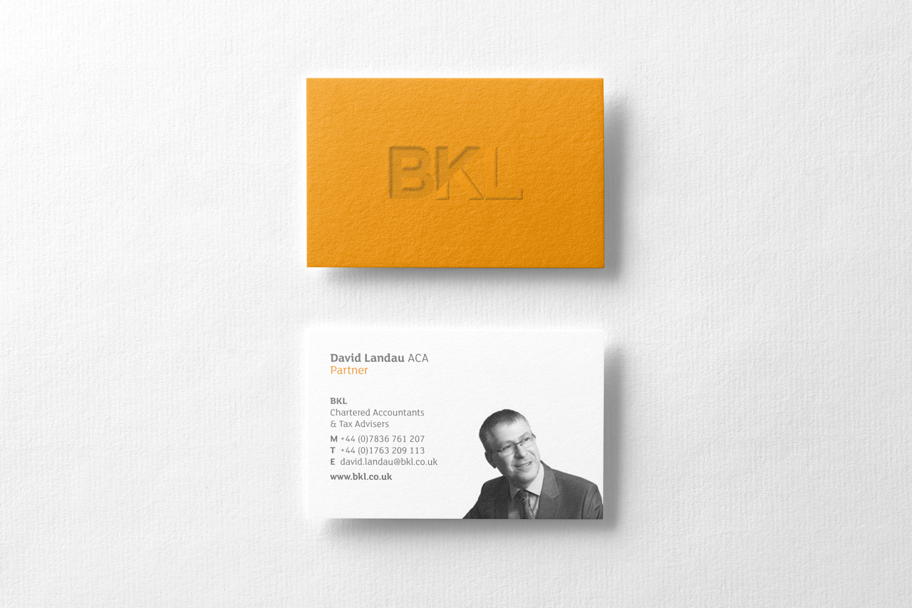
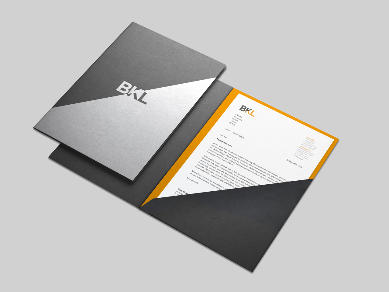
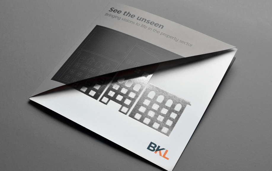
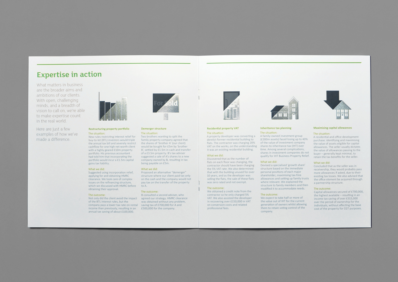
We created a set of materials that creates contrasts between the two sides of the slant, by embossing and debossing, varnishing, black and white to coloured imagery.
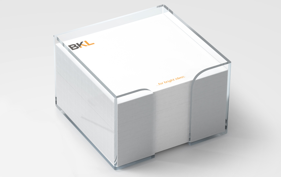
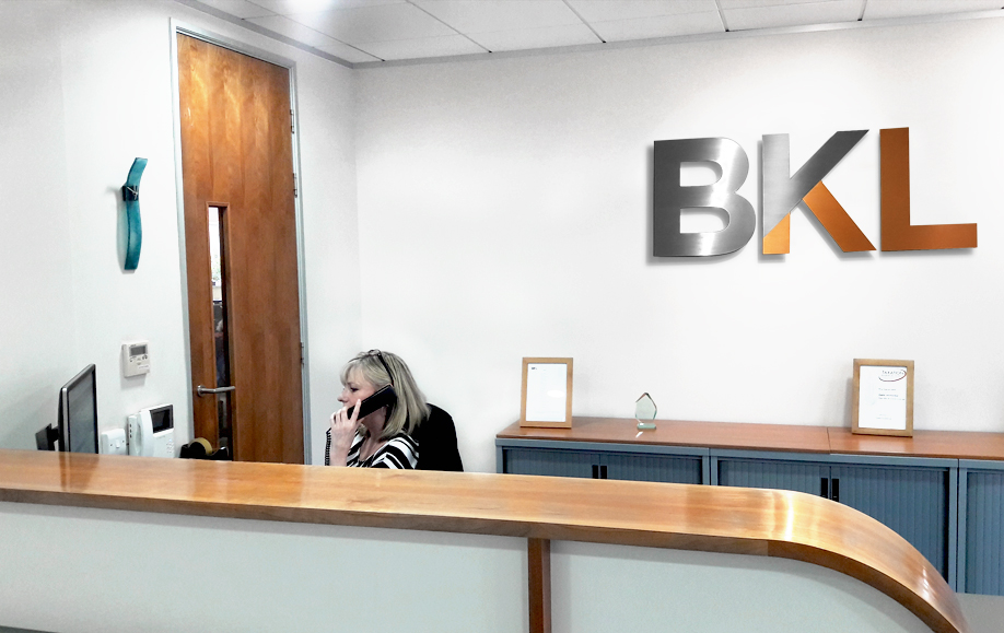
We have rolled out the identity to stationery, reports, folders, brochures, adverts, building signage and their website.
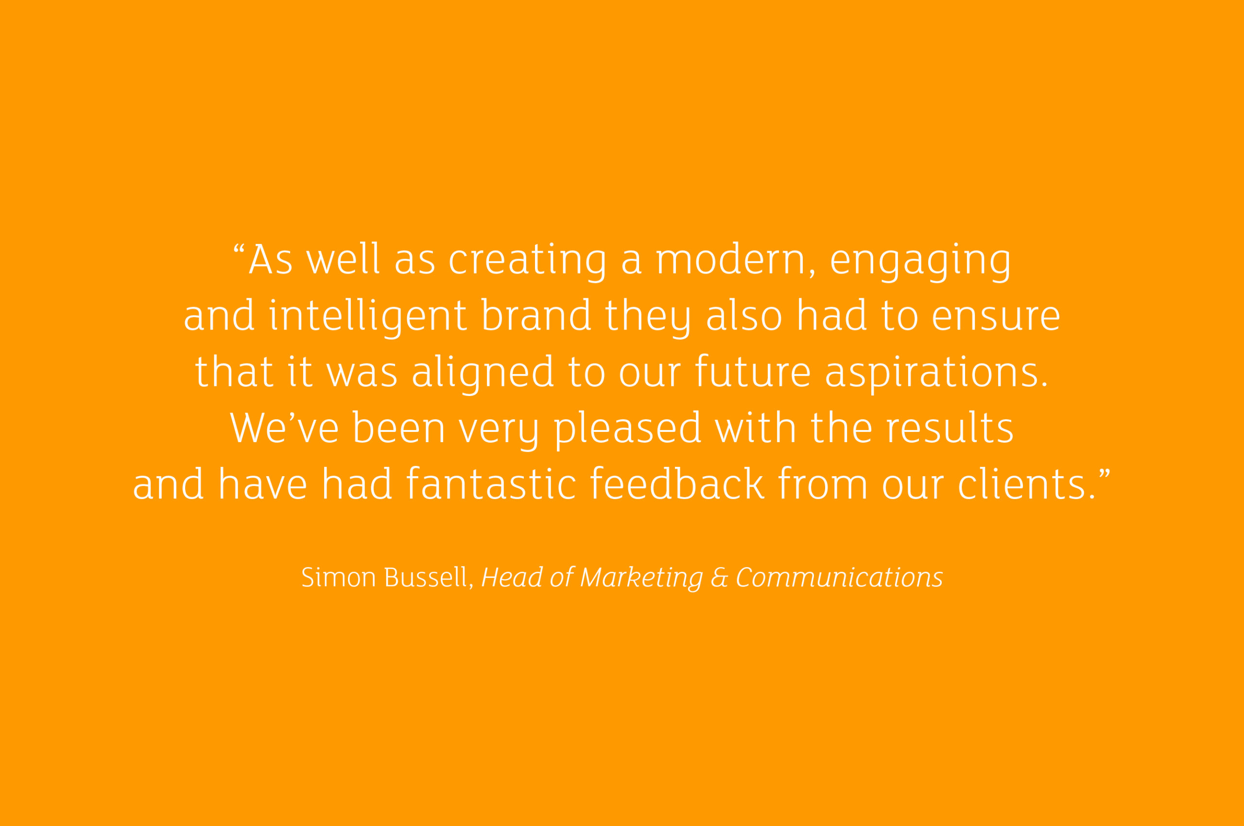
The identity has been very well received by staff and clients.
- Brand identity
- Brand strategy
- Literature
- Signage
- Social media
- Stationery
- Web design
- Word templates
-
£2mincrease in 3 month fee income
compared with the previous year -
90.5%increase in enquiries via the website
-
£2mincrease in 3 month fee income
compared with the previous year -
90.5%increase in enquiries via the website
