Intuito Coaching
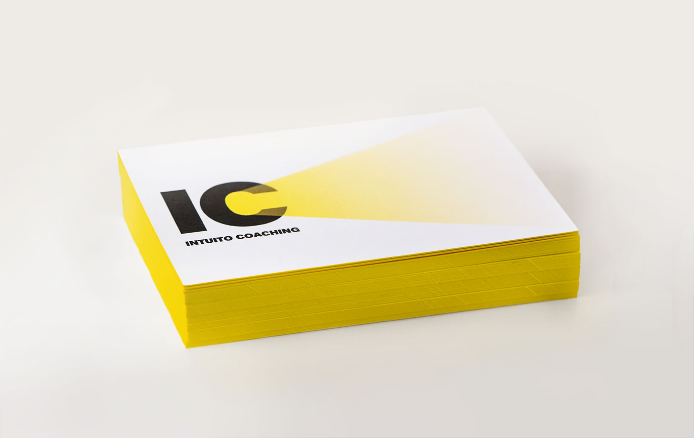
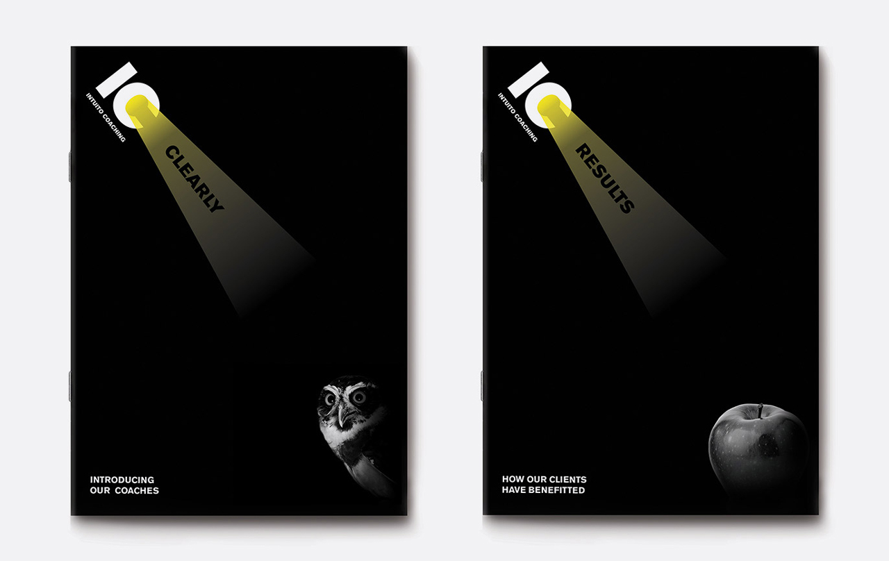
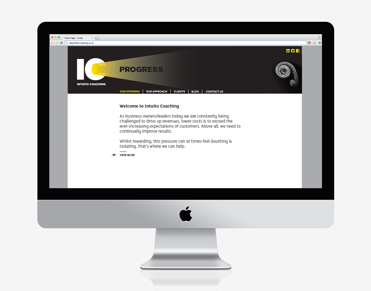
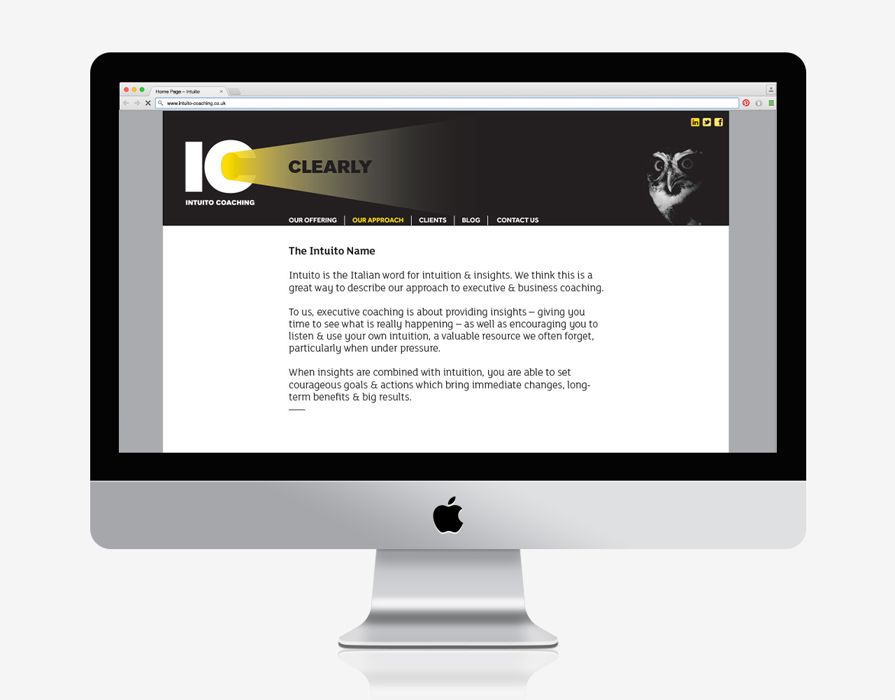
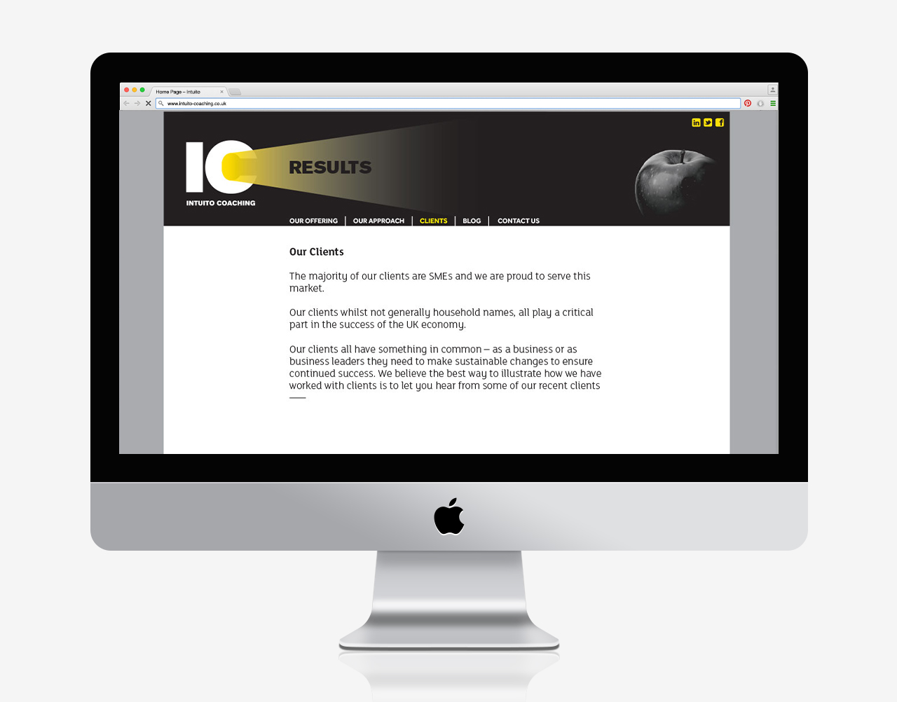
The first thing we noticed was that their abbreviated name ‘IC’ (I see) is an appropriate metaphor for what they do, to help their clients to see the way to solutions more clearly. We used this to prefix a series of words that describe the benefits and results they bring. These are highlighted with a shining light, representing what they do – shining a light on relevant territories.
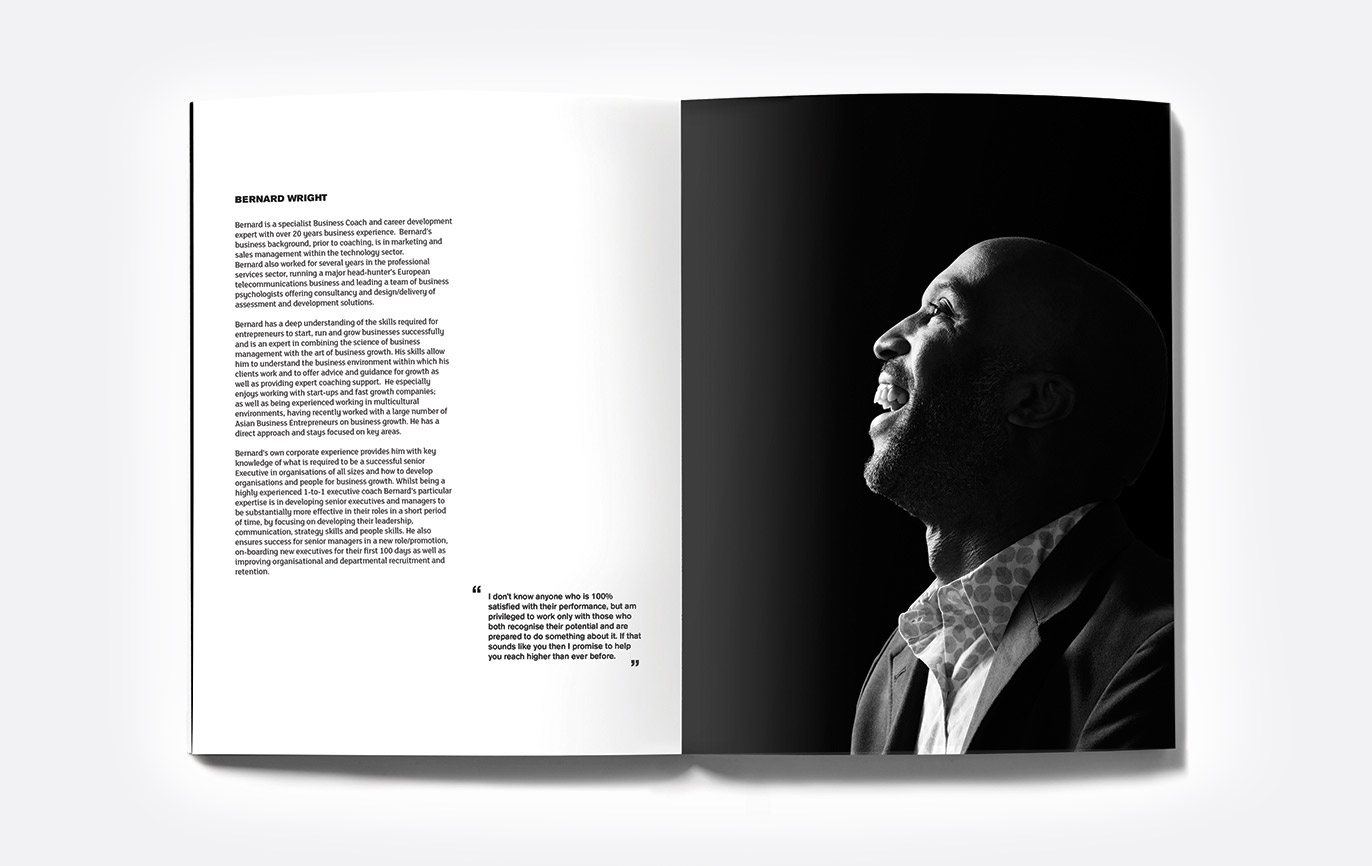
The visual language we developed included side-lit photography to complement the concept, which is featured across their website and literature, while the typography added an element of authority.
Read more...
- Brand identity
- Brand strategy
- Stationery
- Web design
