Land Securities
One of the early challenges of the project was how to bring together the various parts of the business, Retail, London Portfolio, Trillium (a property outsourcing business they had just bought) and Community Development. This required a brand architecture solution, which we resolved with a series of suffixes attached to the evolved logo.
This project was very much an evolution, not a revolution. The CEO didn’t like the existing logo as the symbol didn’t integrate with the name. We didn’t think the colours were modern enough for them, whereas the logotype was contemporary and clean, so in our opinion only needed tweaking.
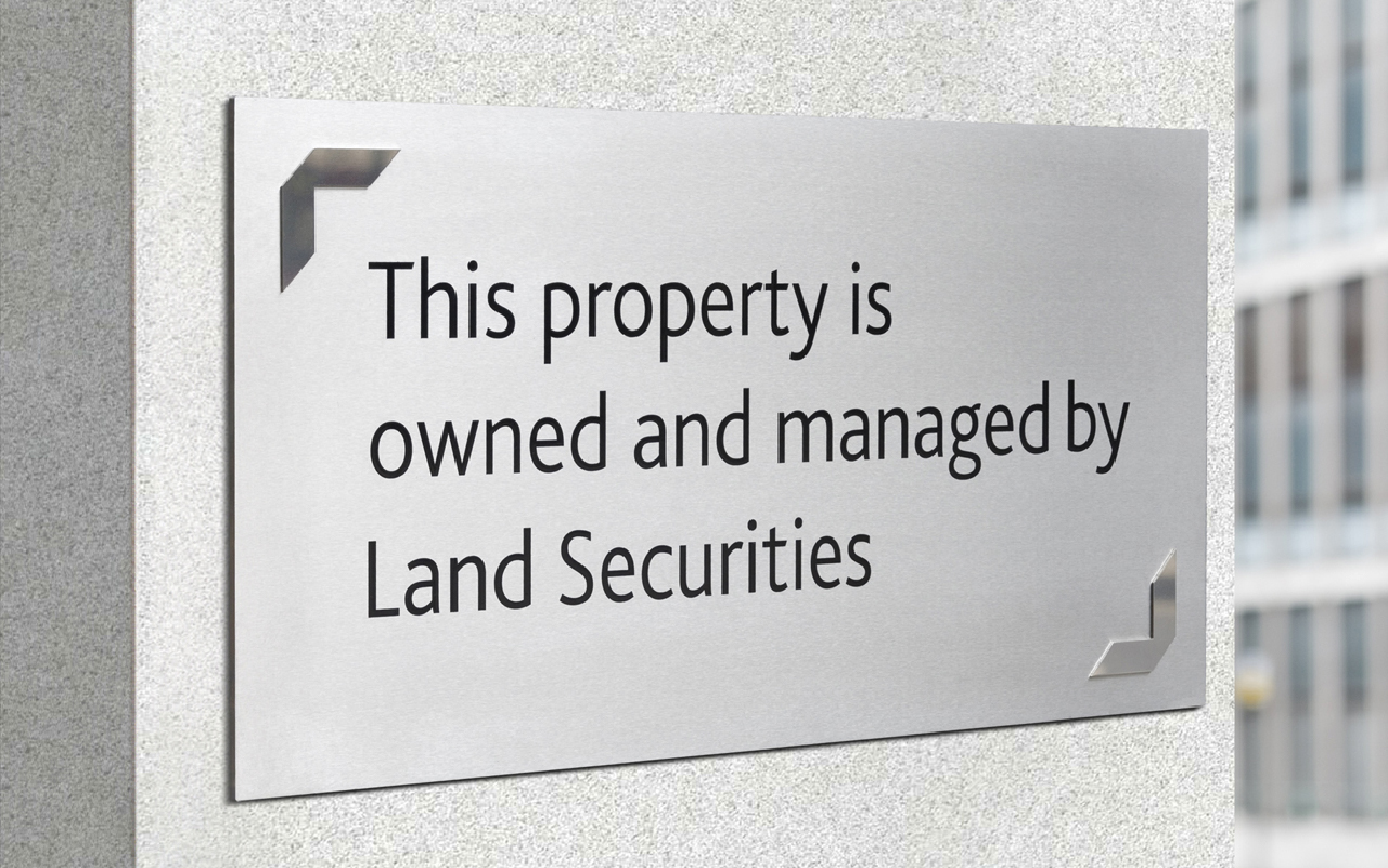
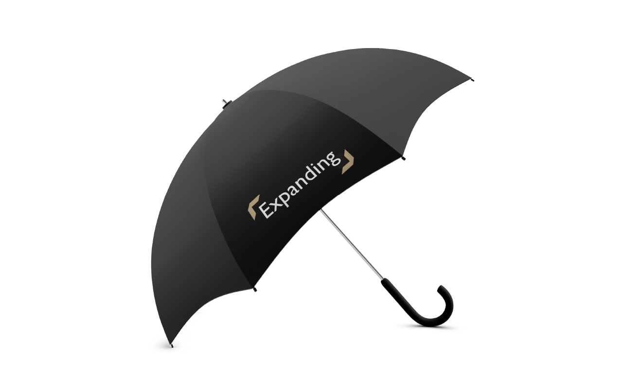
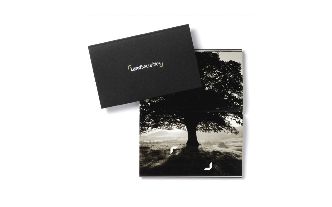
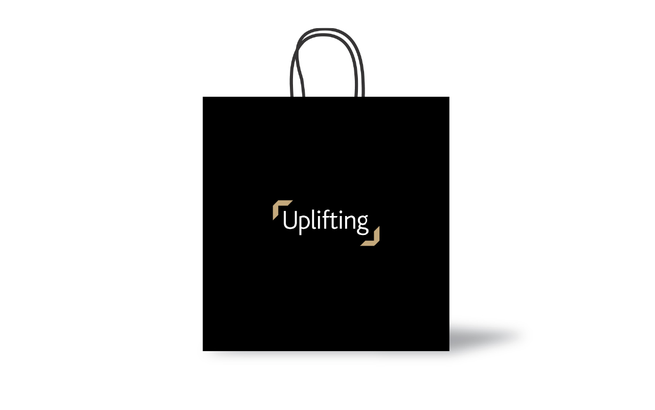
So we created a framing device using the Ls from the old logo, but making them more three dimensional. The Ls frame specific areas of images or words and phrases to provide an ownable, distinctive device.
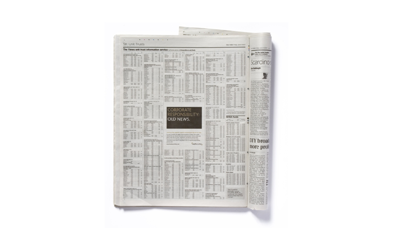
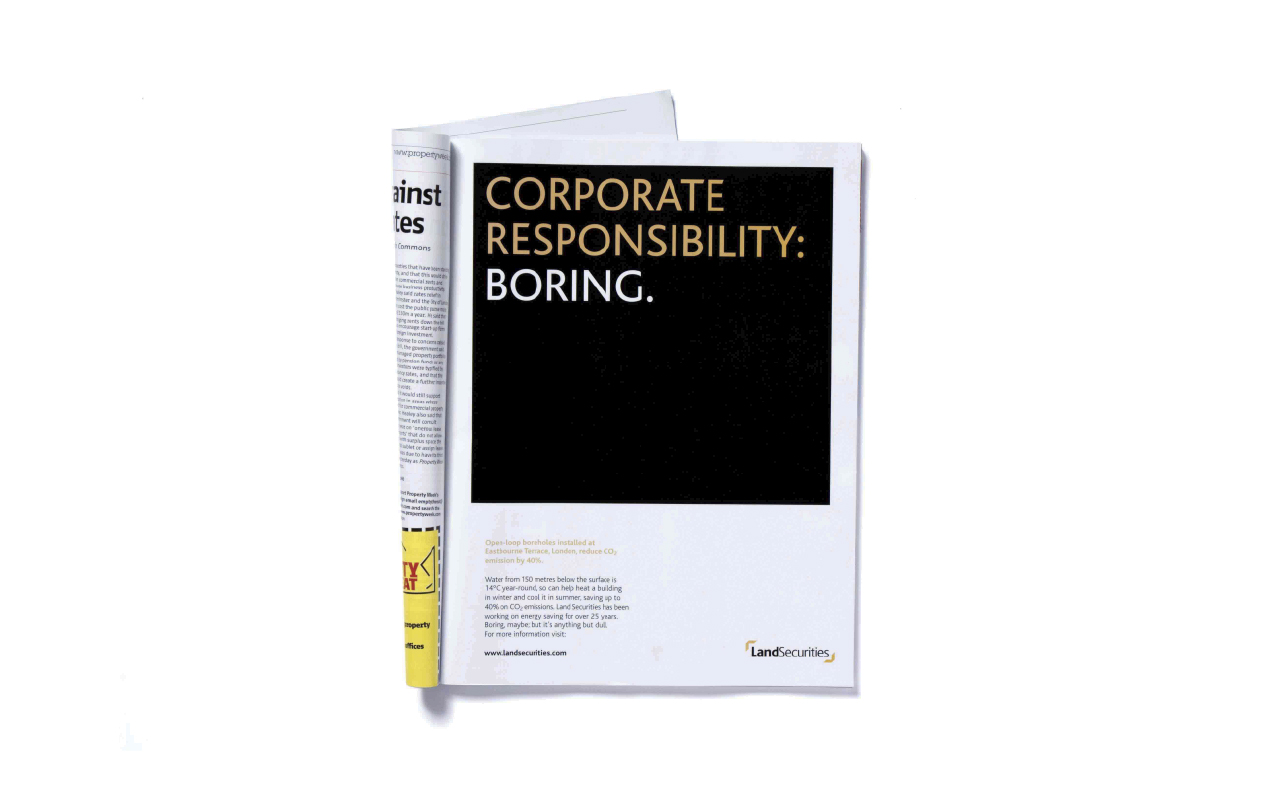
After much colour deliberation with the board, we introduced a black and gold colour scheme, which was more premium and contemporary than the previous dark blue and burgundy.
We produced a comprehensive brand identity guidelines document for all parts of the business.
We also created internal comms, a small booklet for all staff, introducing their new values using the evolved identity. This played a part in aligning staff behind a single culture across the group.
- Brand identity
- Brand strategy
- Campaigns
- Event graphics
- Literature
- Powerpoint templates
- Promotional items
- Signage
- Social media
- Stationery
- Web design
- Word templates
