Literary Executors
We recommended:
• Highlighting keeping estates safe and secure
• Providing an easy to understand resource for those who would be new to this world
• Keeping a focus on what Literary Executors does using words
We designed the logo to have the look and feel of an authoritative coat of arms, relatively classical, but with a modern twist.
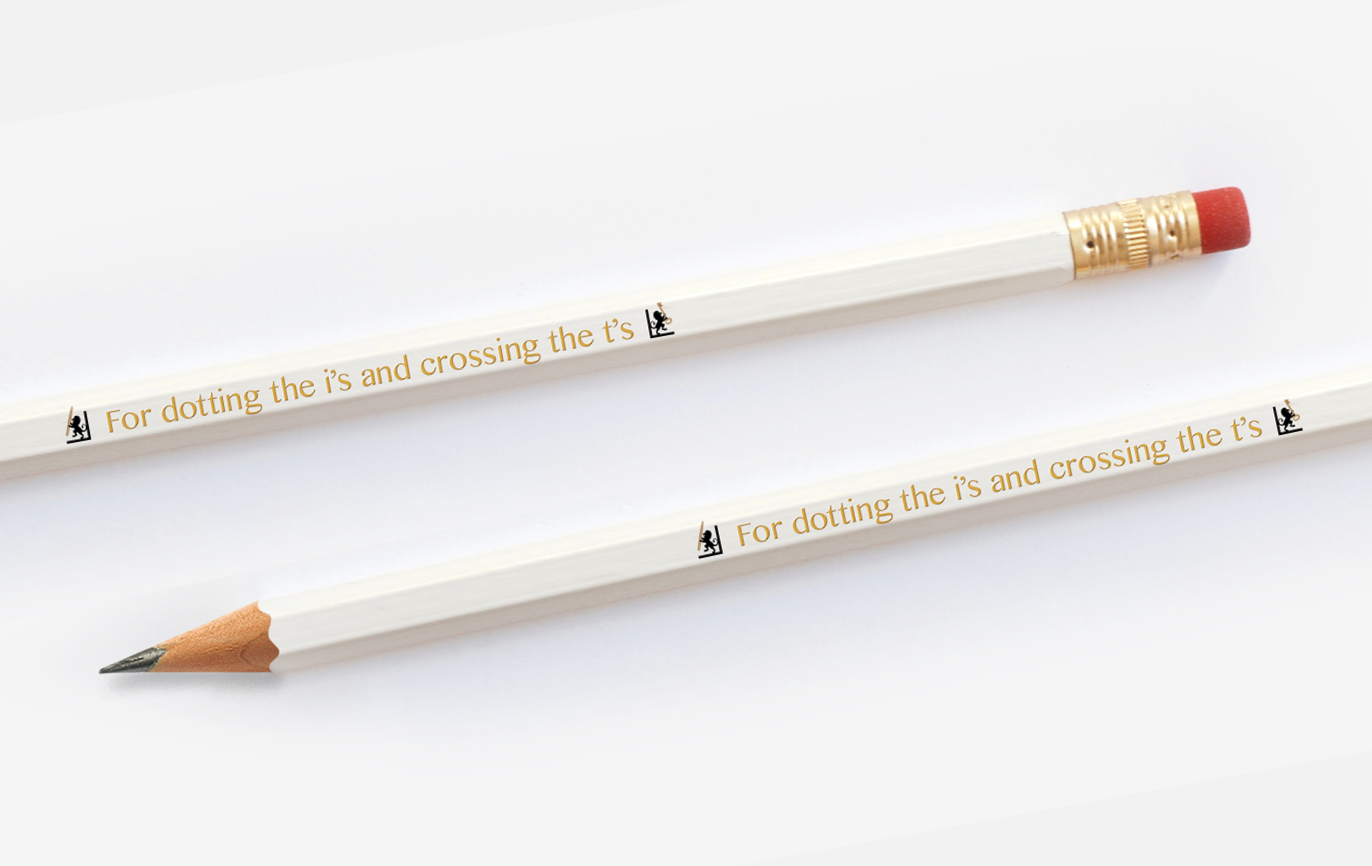
The crest is made up of books on a shelf, bookended with rampant lions as a symbol of strength and protection. One lion holds a key and the other clasps a pen to represent security and authorship. The bookends are then used as a framing device to contain and highlight text.
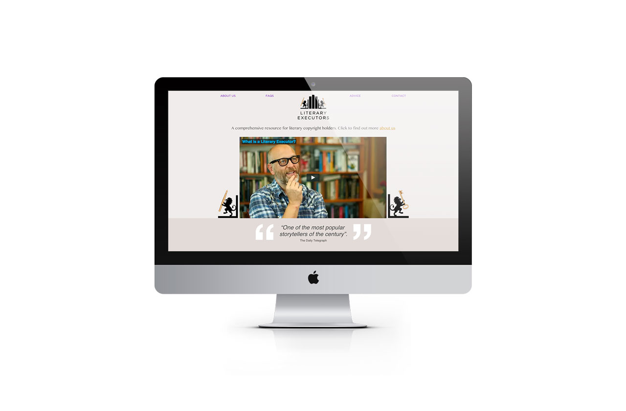
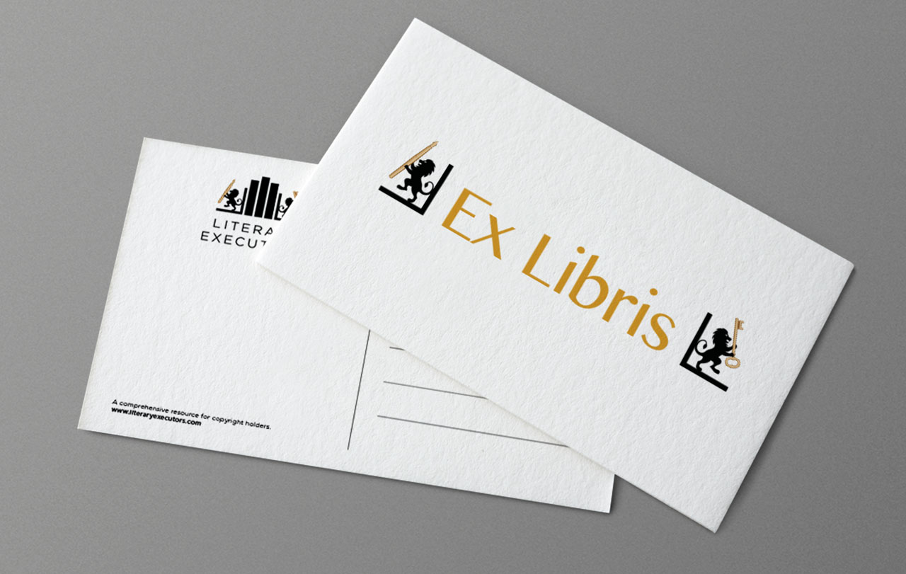
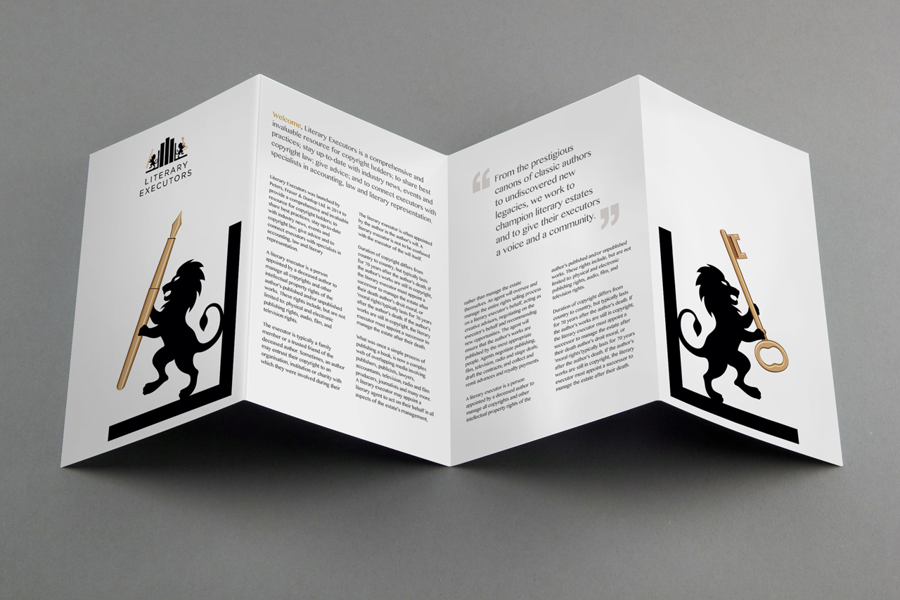
As a cohesive identity we bookend words and phrases across various communications materials and the website itself.
Read more...
- Brand identity
- Brand strategy
- Literature
- Promotional items
- Web design
