Meyer Bergman bought a shopping centre in Ostrava, Czech Republic, shortly after it opened. A local agency had already created a logo and their advertising featured a supermodel, which didn’t suit the demographic at all! This is not a wealthy area of the Czech Republic! Meyer Bergman wanted to set the correct tone for communications and create a brand that spoke to the local people.
Our brief was to create a coherent brand identity which would describe what the centre offers – something for everyone all under one roof. It is a massive centre and so much goes on there. It has a cinema, bowling, a creche where kids dress up as pirates and princesses, food outlets galore and of course fashion retail. It really is a destination place where people can come and meet, lunch, drink, play and shop.
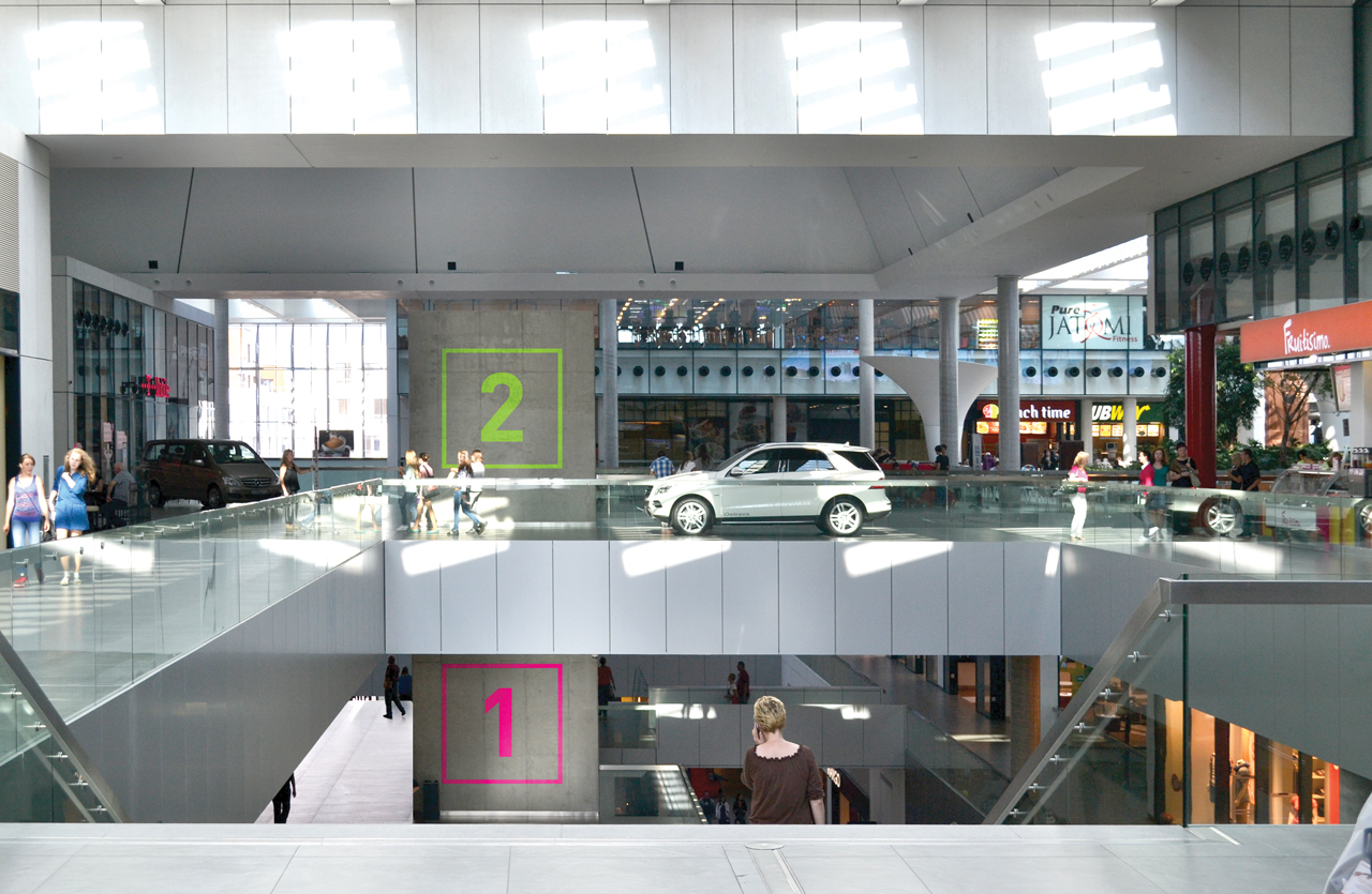
The architecture of the centre is actually incredible, and helped to inspire our thinking.
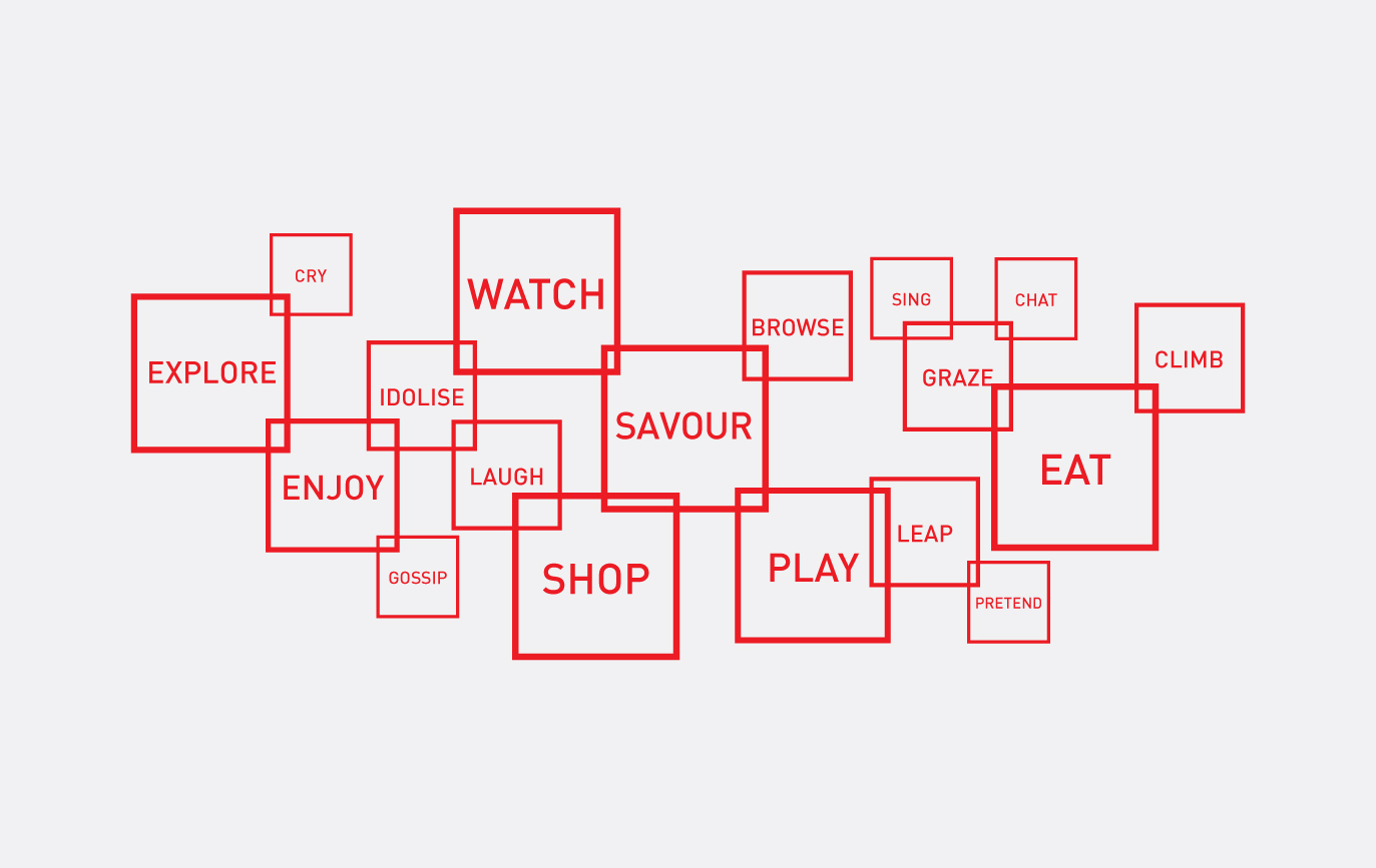
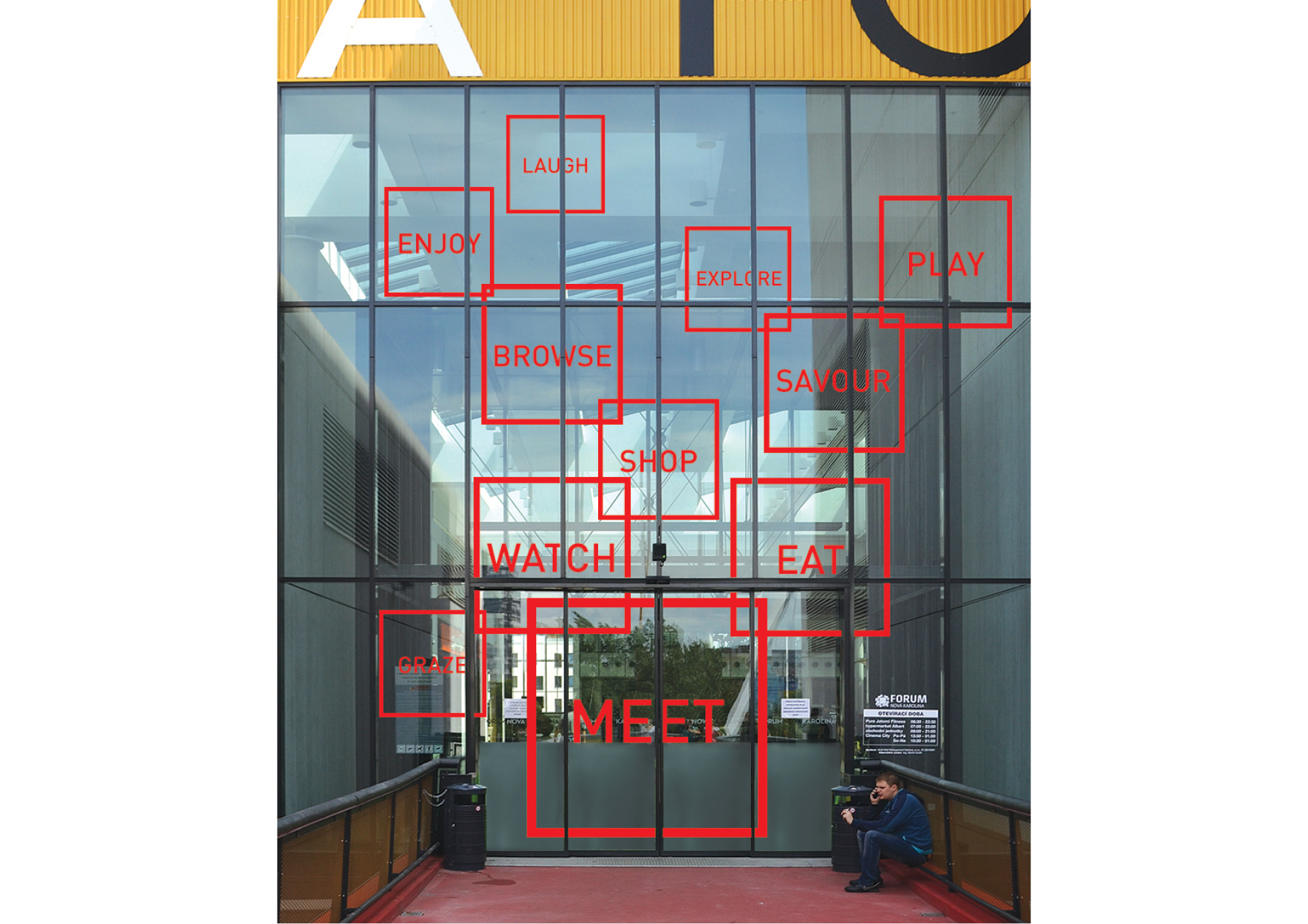
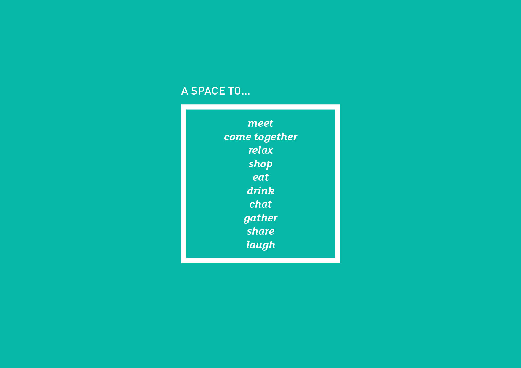
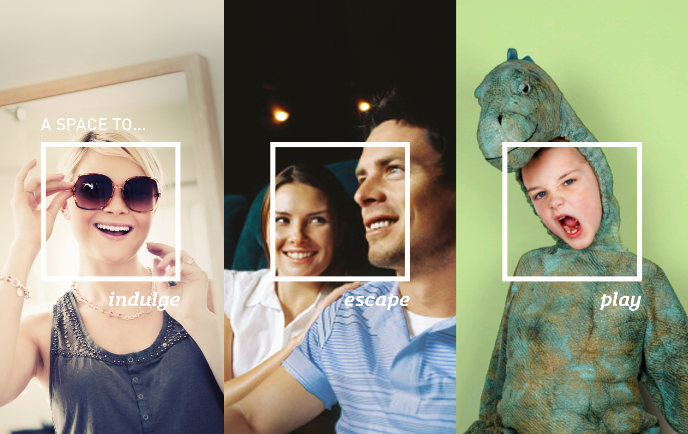
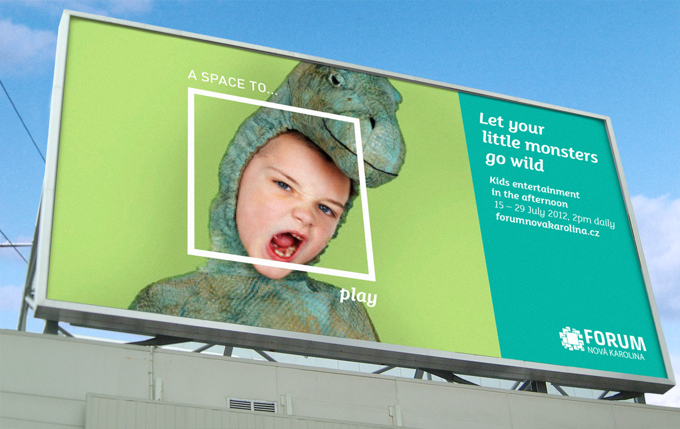
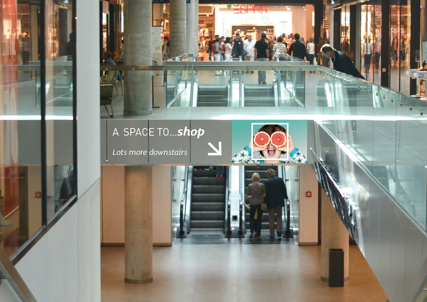
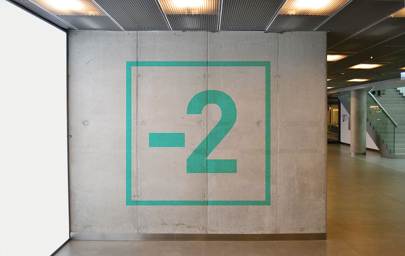
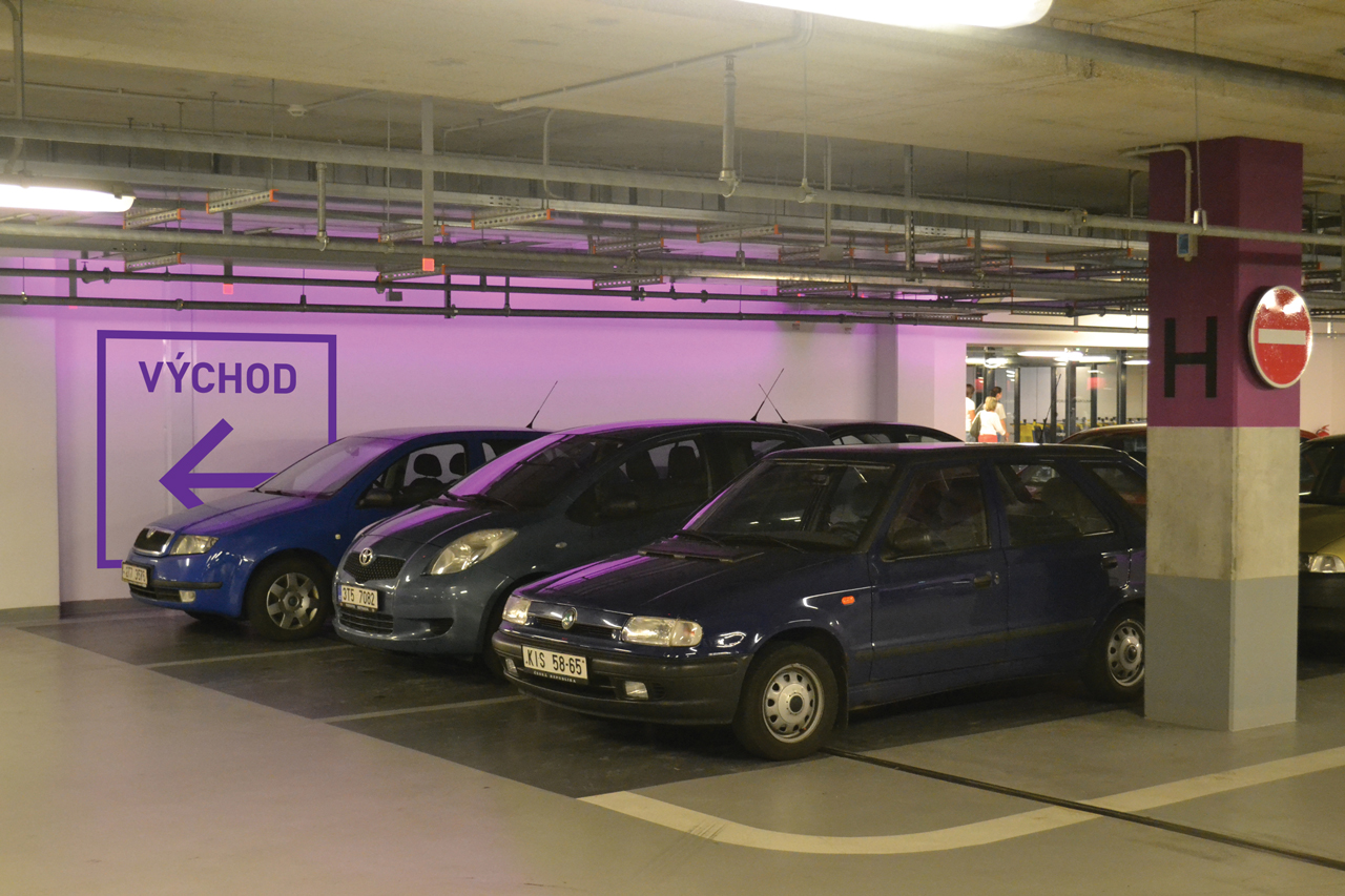
Our idea was to introduce a square frame, taken from the centre’s architecture and rather over-colourful logo, and used it to frame all the many activities that go on within the centre, using appropriate imagery and words.
We recommended that advertising led with very human phrases, rather than the matter of fact detail. This dialled up the tone. We also introduced strong fresh colours with their busy logo reversed white out to modernise it.
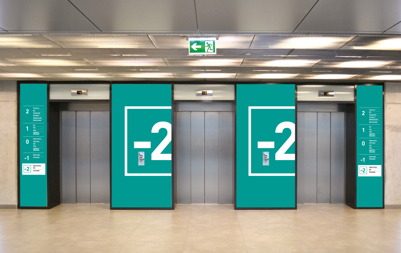
Our guidelines were provided to local agencies to implement advertising, promotions and environmental graphics.
Read more...

