Mustard
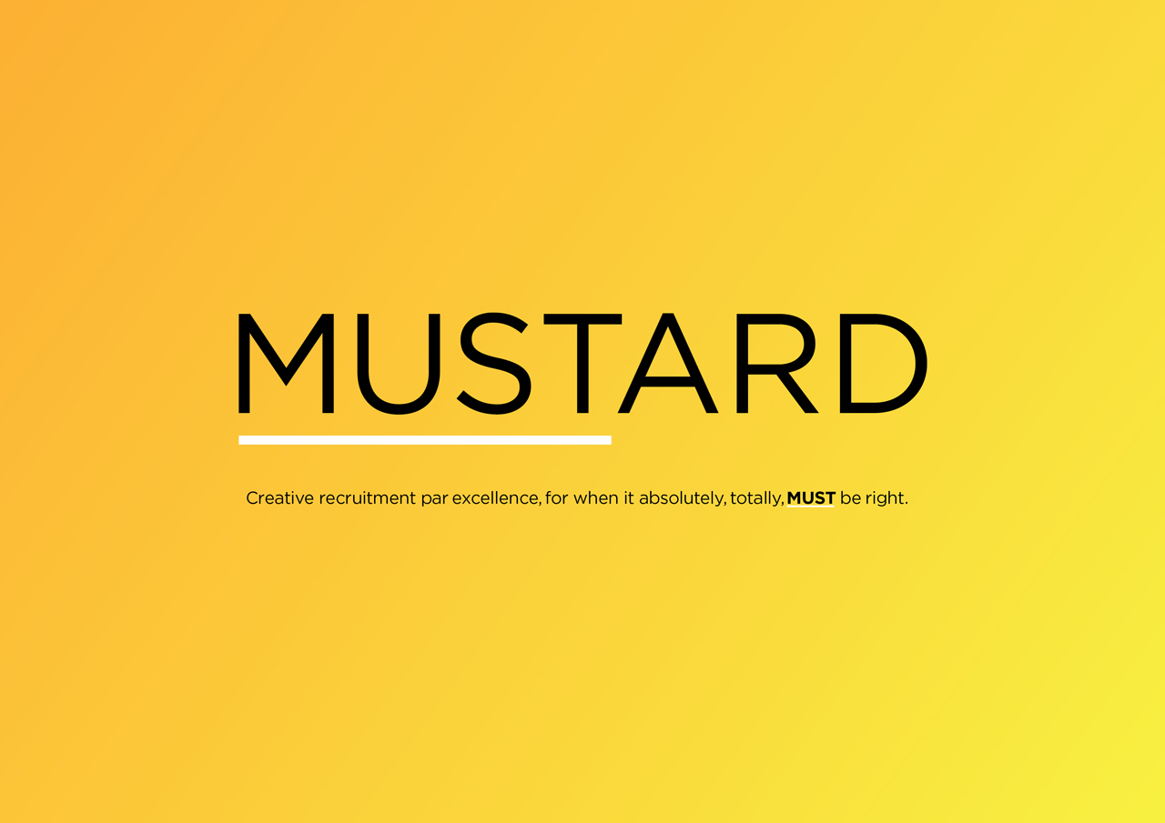
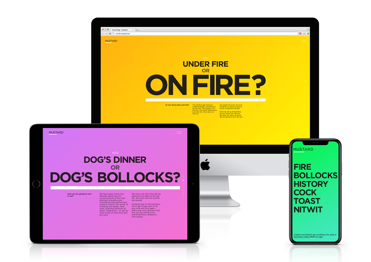
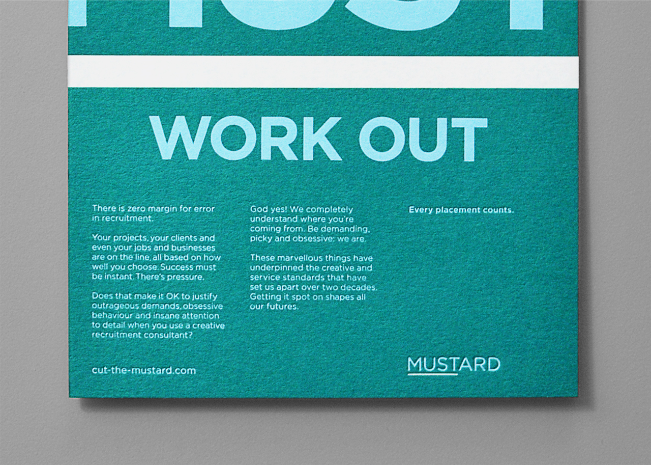
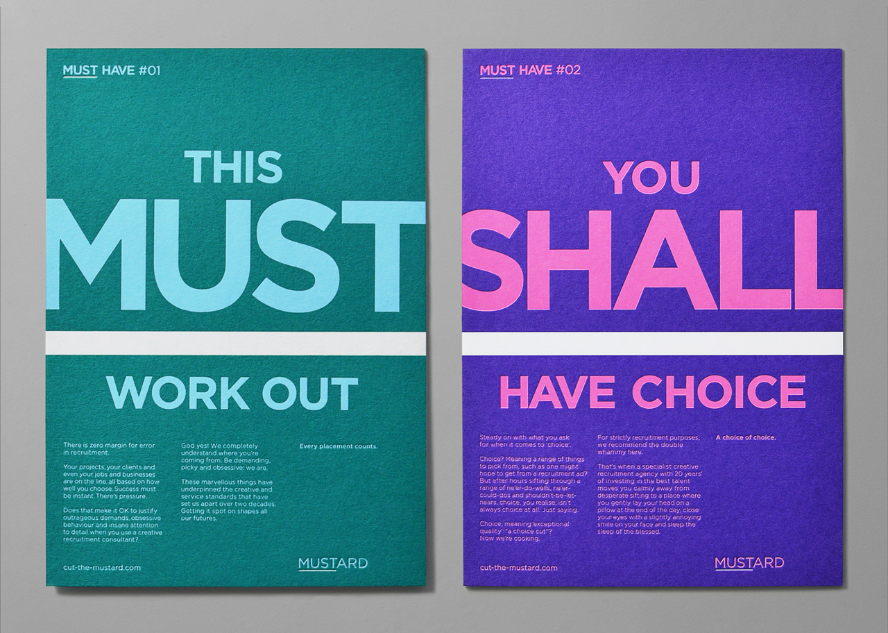
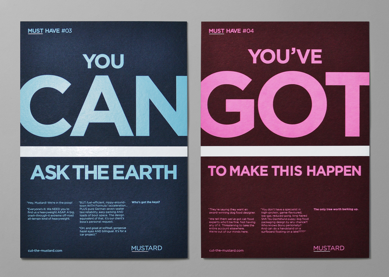
We did this by drawing out the ‘MUST’ in the name to reflect the urgency and importance of getting placements right. We used typography to increase the sense of stress, enlarging key words. And then we used humour to let off steam and make our point: crazy, truly impossible demands… but if anyone can meet them, it’s us. The tone is key: calm and good natured in the midst of a storm… people you can count on.
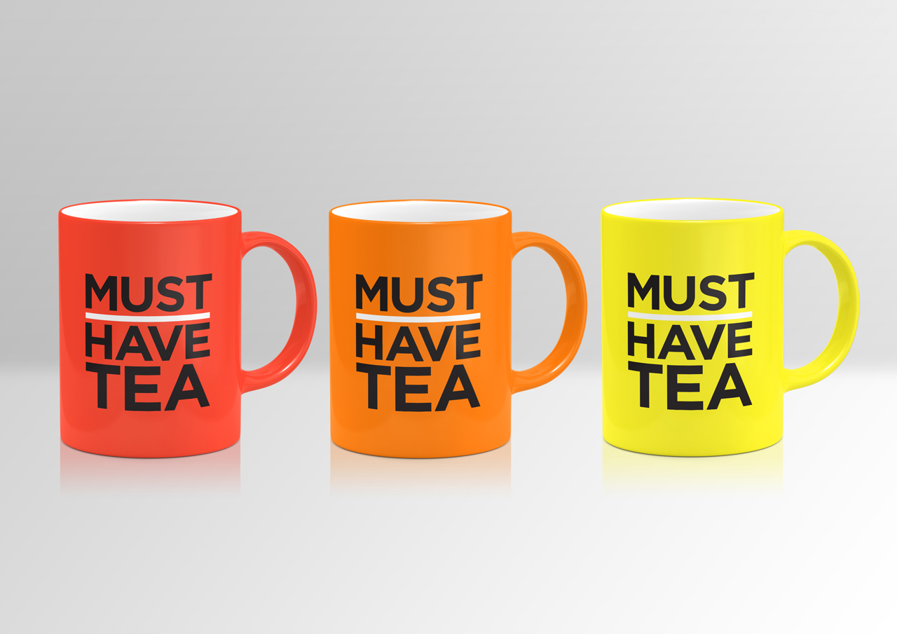
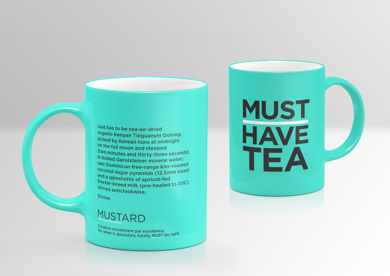
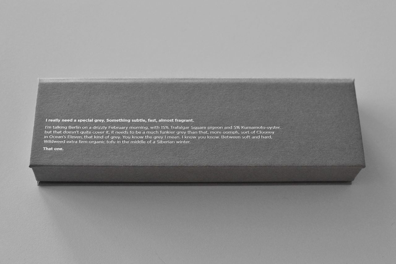
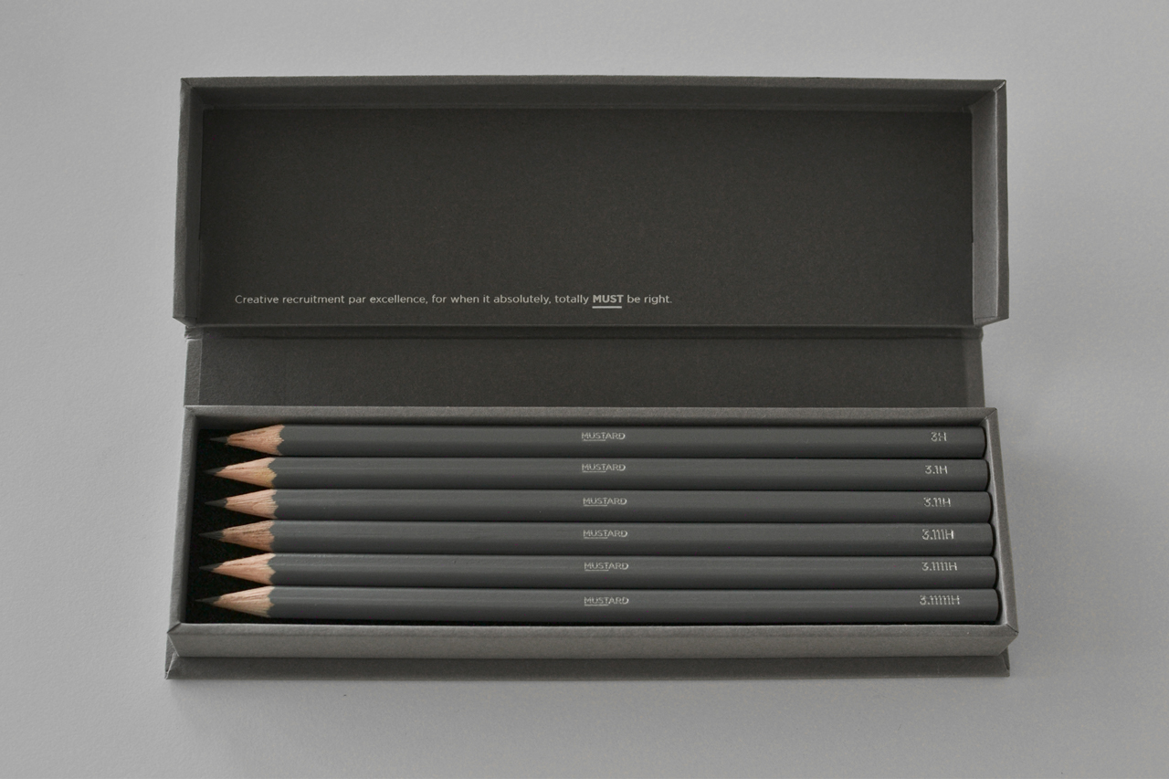
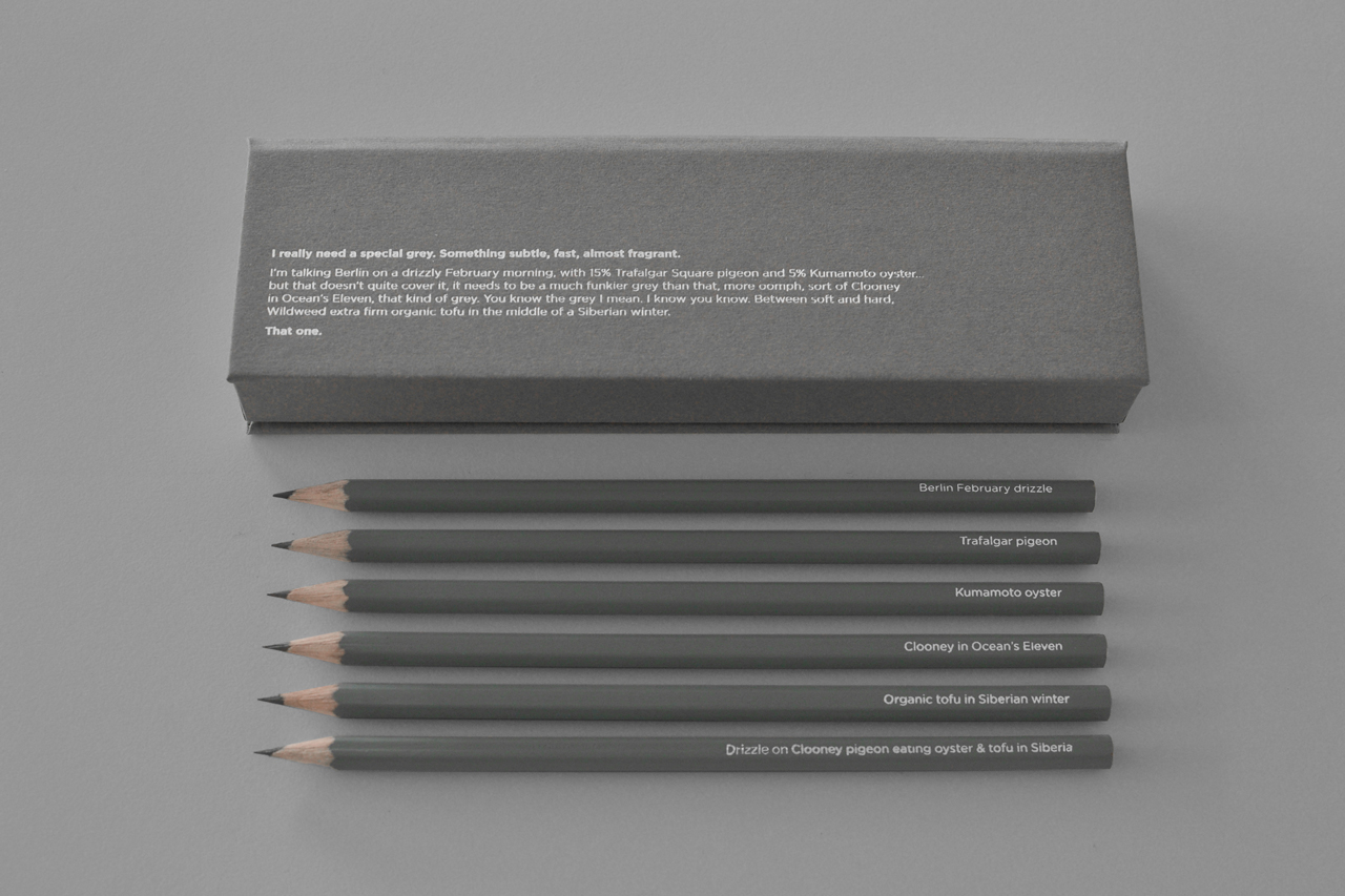
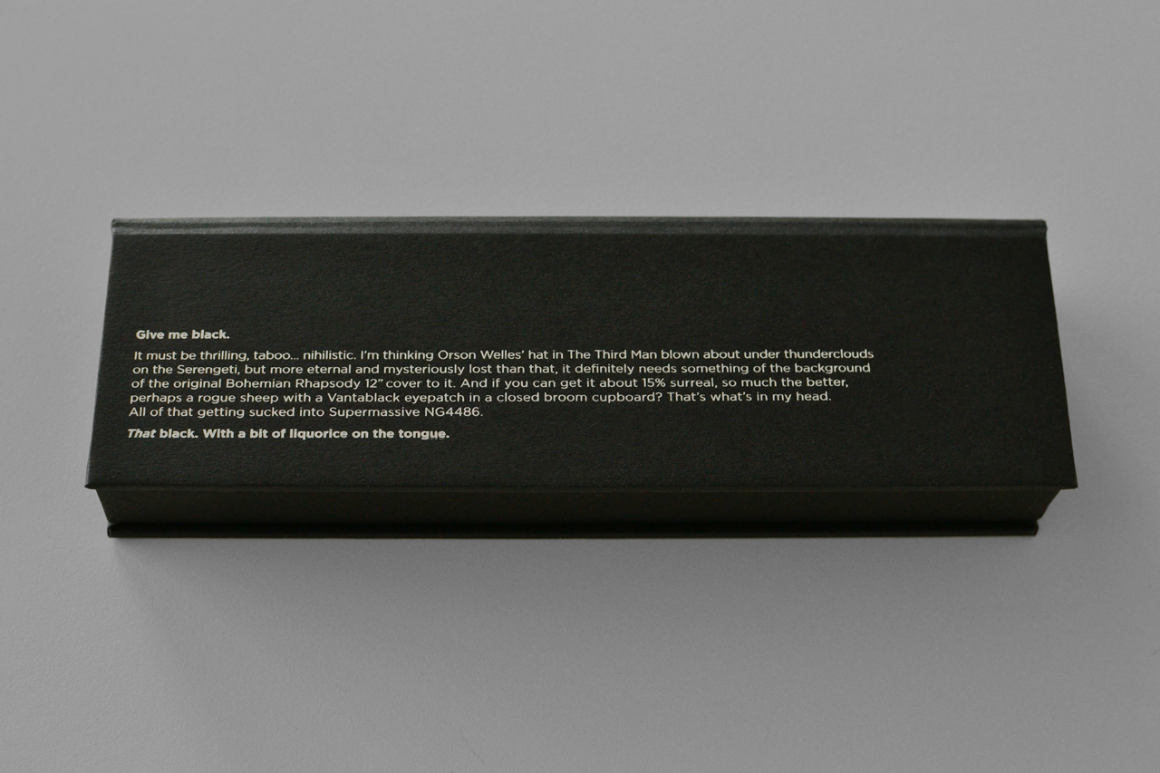
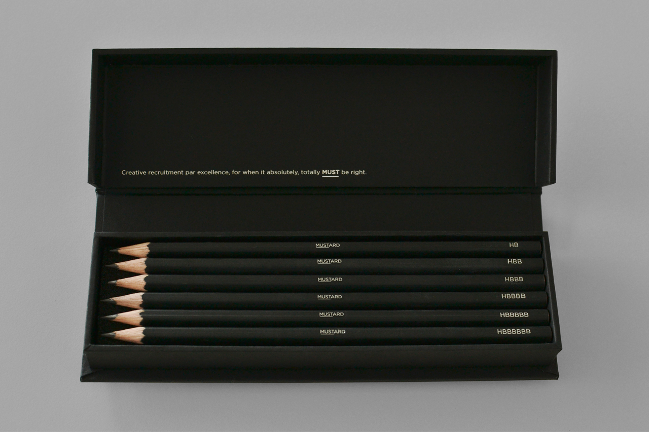
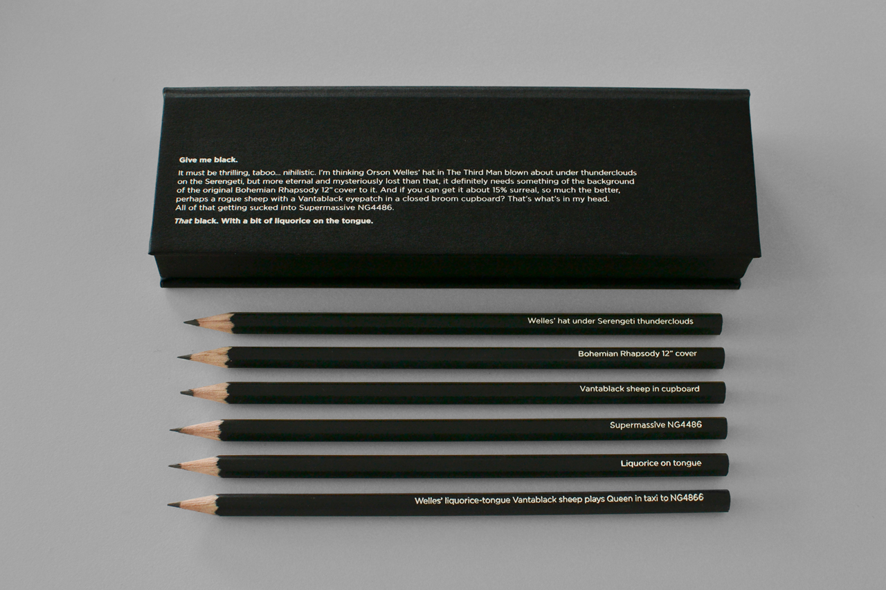
As well as the identity we designed a website and a series of promotional items. This included a set of black and grey pencils, with matching boxes. The pencil boxes were foiled with whimsical and hyper-pedantic copy which introduce the complex shades of black or grey that you may be looking for. The pencils themselves range from ‘HB’ to ‘HBBBBBB’ (black) and from ‘3H’ to ‘3.11111H’ (grey) to add another level of wit, absurdity and to continue the picky theme. All of this was to further push the idea, that when you have a particular tricky brief Mustard’s pickiness and attention to detail is the only way to answer them.
This has been a fun identity to work on and we have heavily collaborated with copywriter Scott Perry, the Bard of Bray, to strike the right balance of absurdity and wit.
- Brand identity
- Brand strategy
- Campaigns
- Promotional items
- Stationery
- Web design
