Natural History Museum
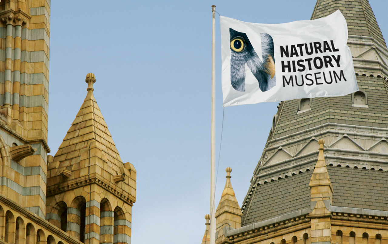
The brand strategy was created by Jane Wentworth Associates, with a core proposition ‘The Power of Nature’ at its heart.
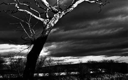
Our first exercise was to use the existing logo and apply it to a new set of communications. The trouble was that it simply didn’t express ‘The Power of Nature’. It looked like a dead tree! Thankfully the Marketing Director agreed and authorised us to explore a new logo.
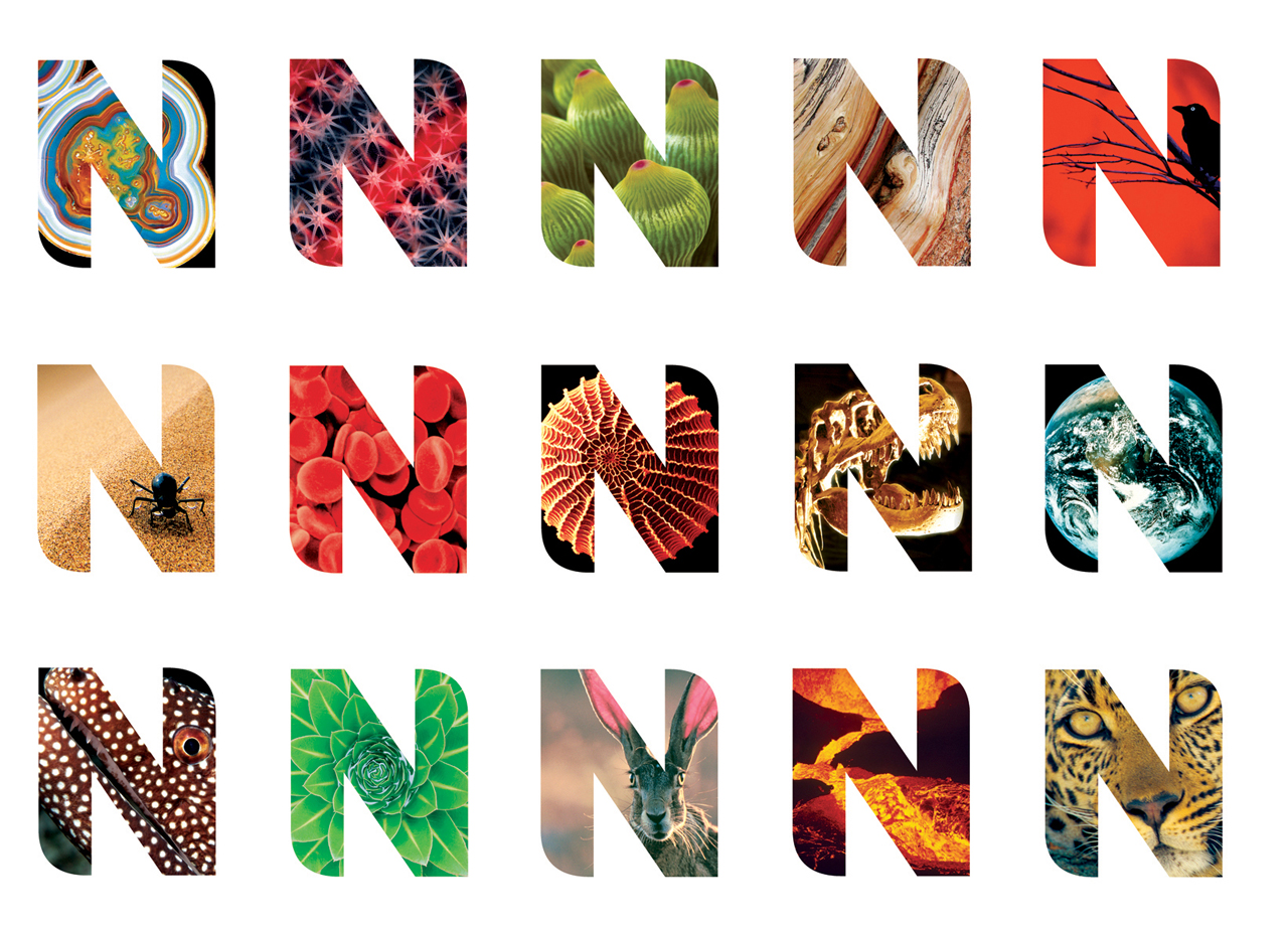
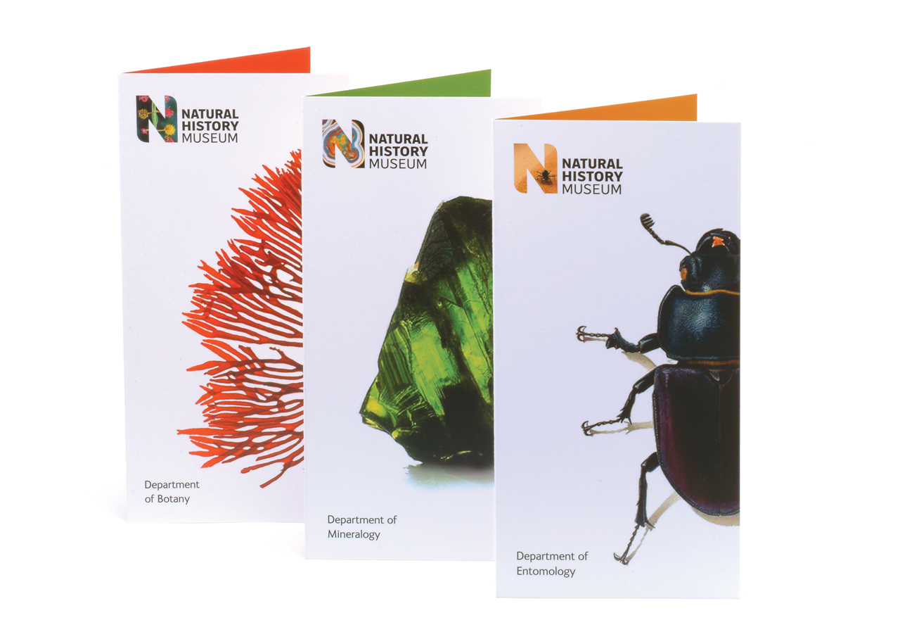
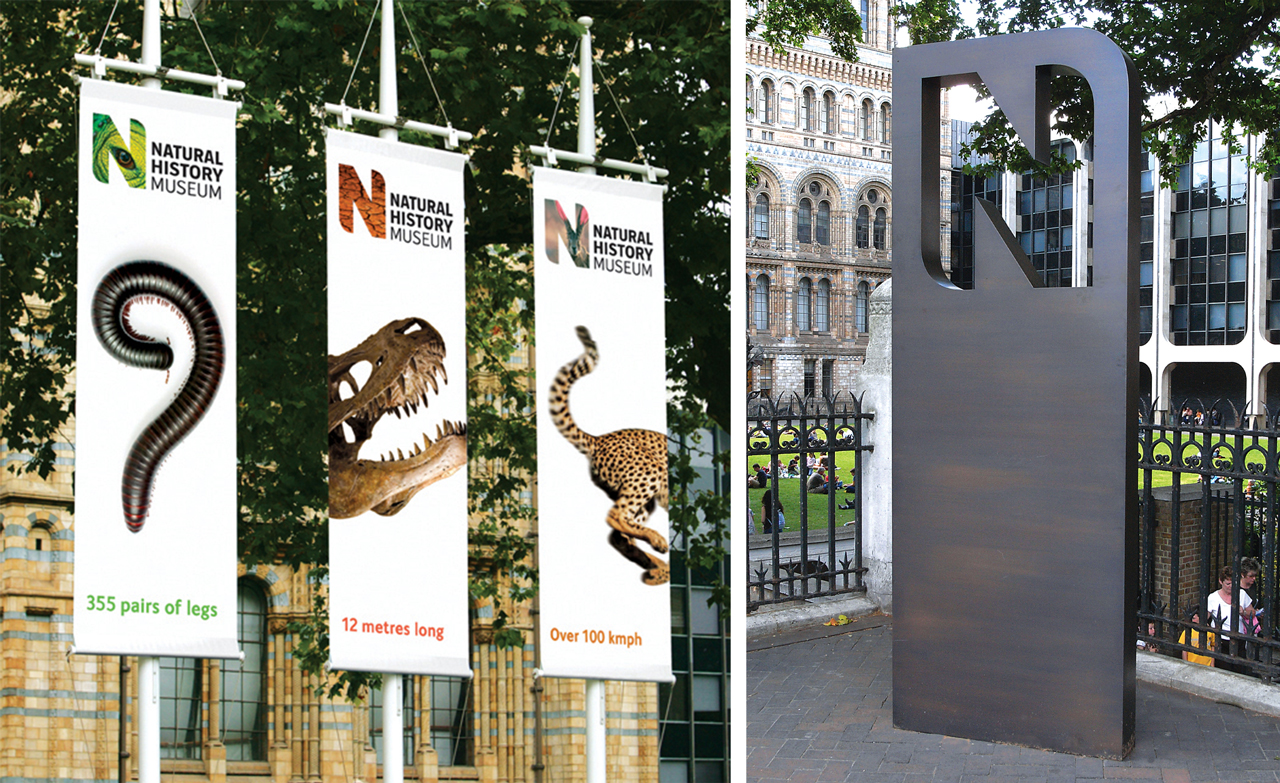
On reviewing their image bank, we were told that they owned the rights to use the photographs of the ‘Wildlife Photographer of the Year’ competition. felt like a no-brainer. The power of nature can be expressed in many ways, but it struck us that one way was to express the diversity of nature through a broad range of powerful images, shown through a distinctly shaped letter ‘N’, creating a window on the world of nature.
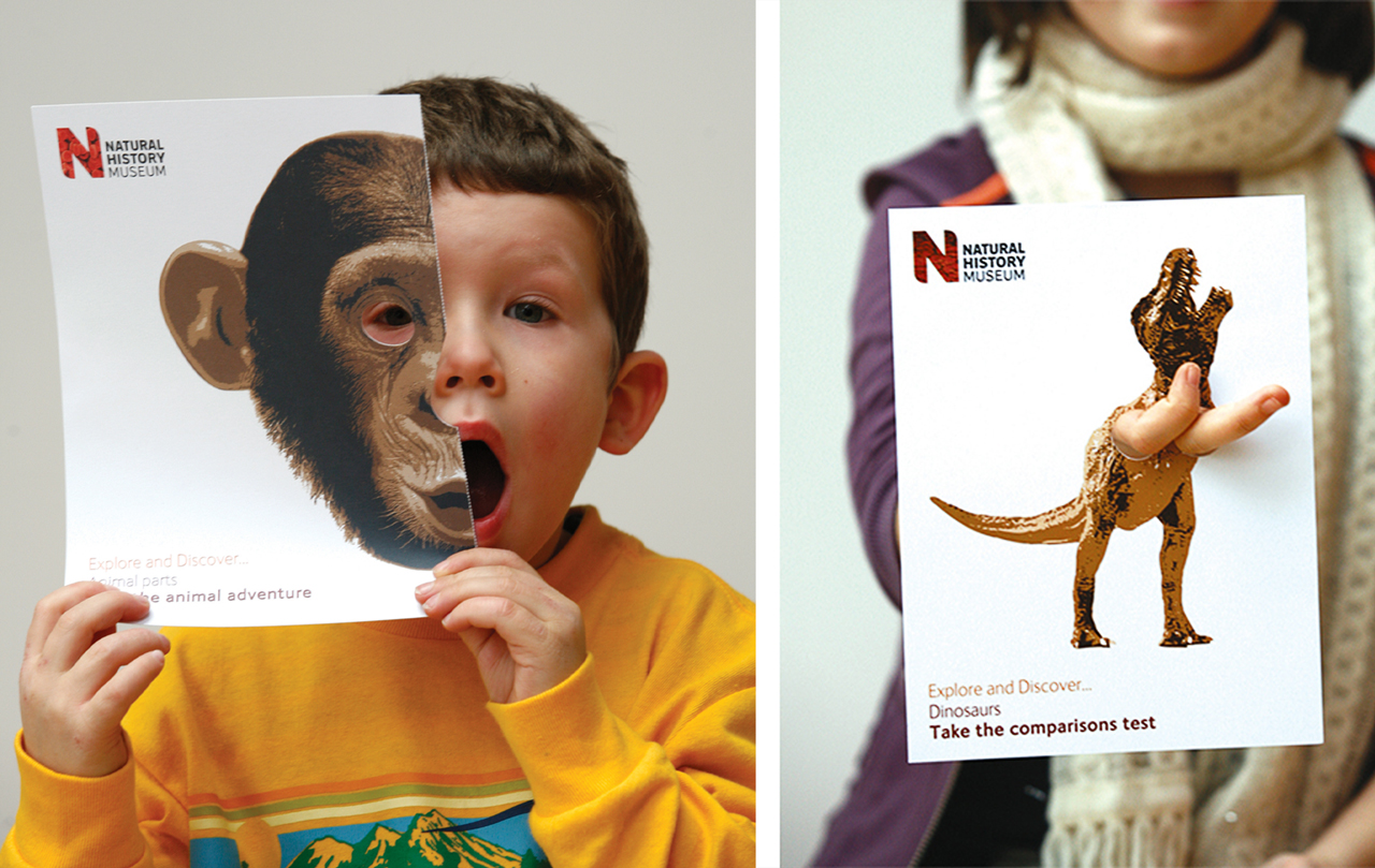
A key consideration for us was to create a consistent look and feel, whilst having the ability to change the tone of voice to suit very different audience types, from children to scientists.
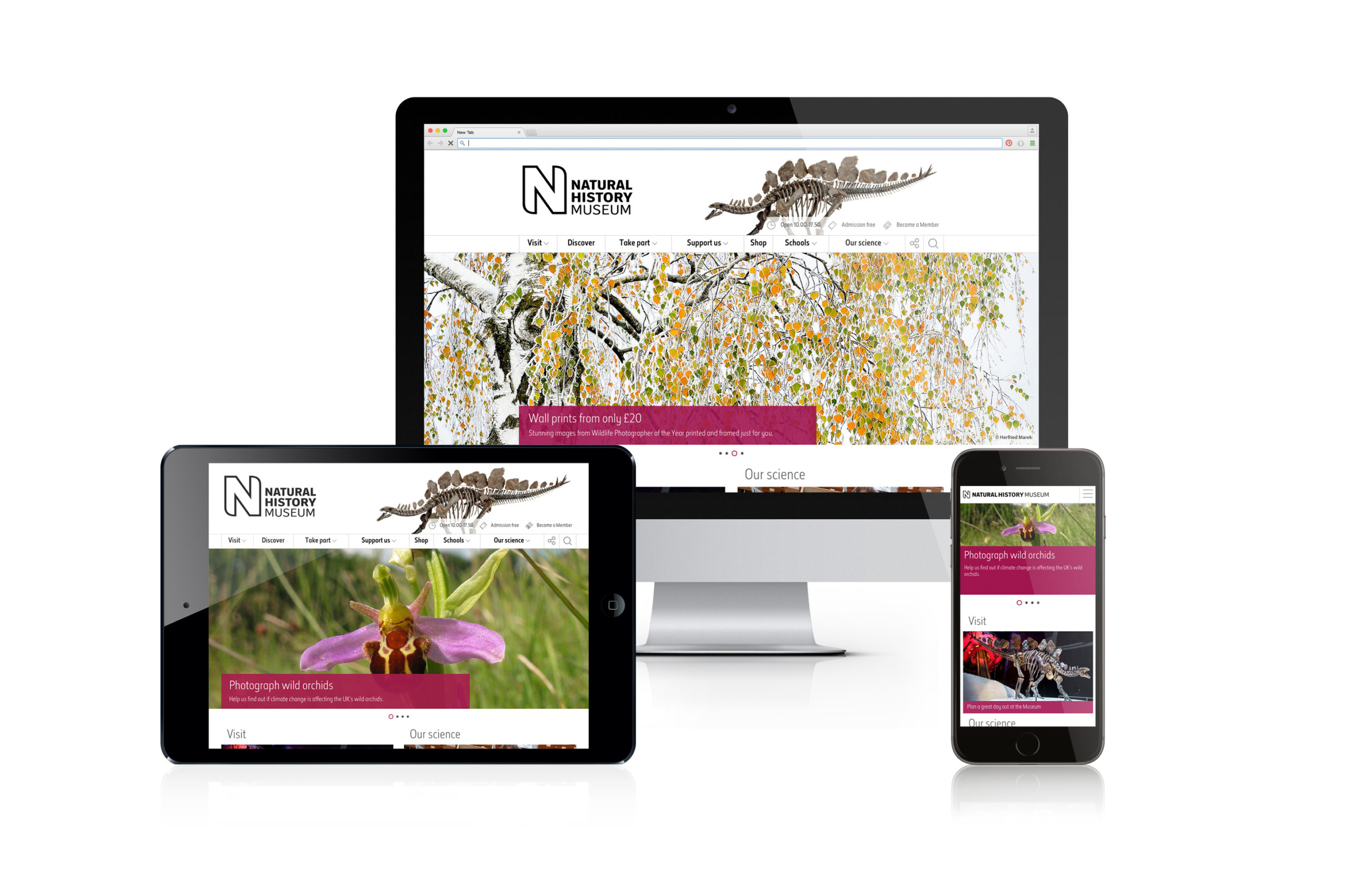
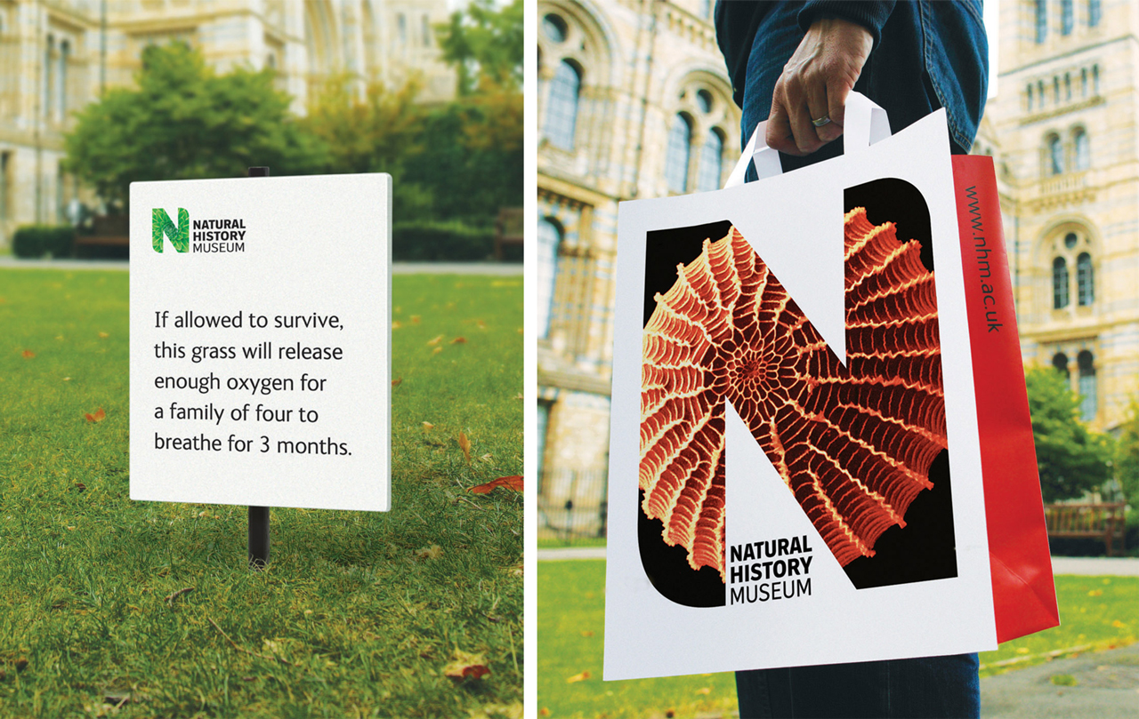
The identity has been used expertly by the in-house marketing department and external agencies and has stood the test of time. It periodically adapts and develops, but its heart is still very much beating.
- Brand identity
- Campaigns
- Event graphics
- Literature
- Promotional items
- Signage
- Stationery
