Purcell
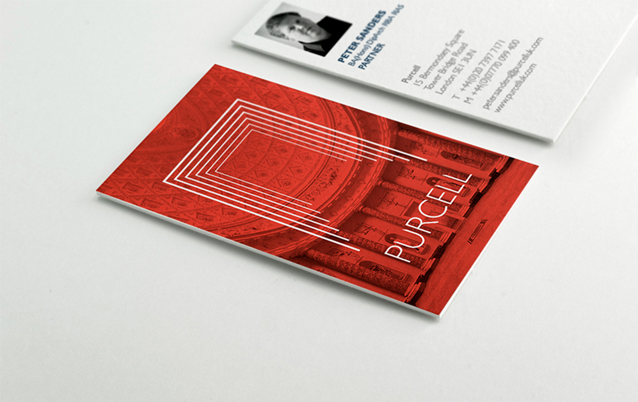
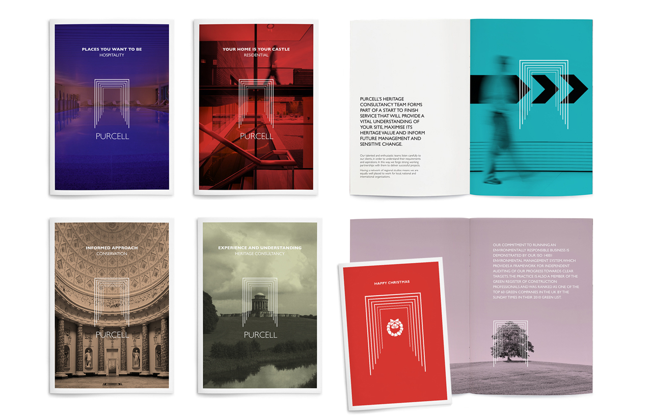
Our brand strategist Amanda went to work. At the heart of the brand strategy was their core proposition ‘Thoughtfully designed evolution’. Three carefully chosen words which summarise their being. This inspired our logo, which references a continuously progressing journey, future opportunities, and of course architecture. This was styled in a modern classic way, to find the right balance for their diverse activities.
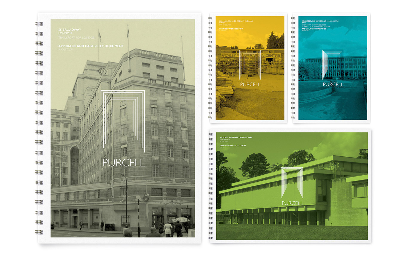
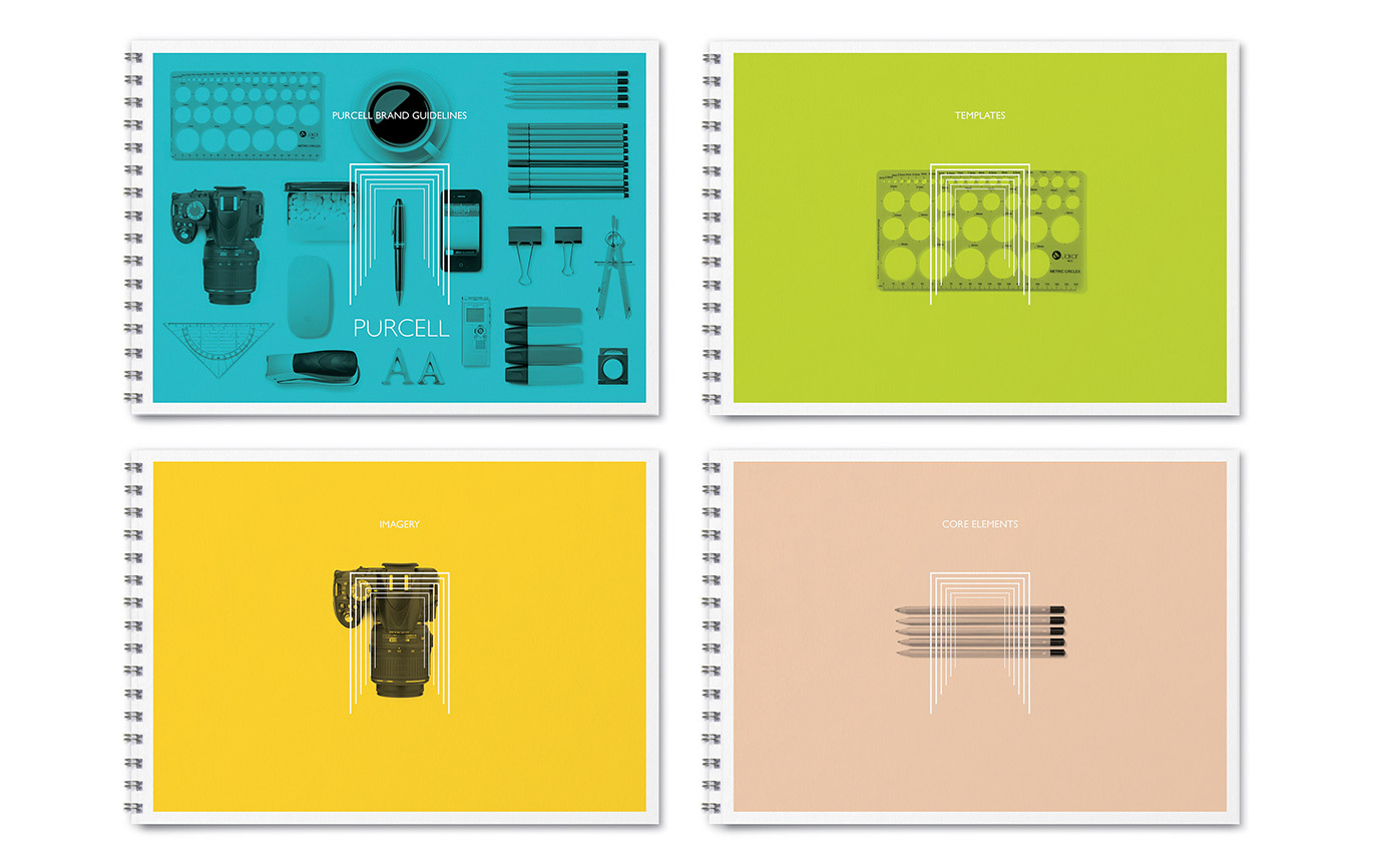
We introduced a confident use of their logo on submission documents and proposals, placing it front and centre, so that it overlays and integrates with their client’s projects, shown as photos. They were keen to retain the images of their client projects on the covers of bids and documents, even pre-project, so we recommended making the photos greyscale and overlaying a wash of colour from a designed palette. This became the central part of their visual language, creating consistency with flexibility.
Since rebranding Purcell, the perception of the practice has changed, allowing them to present current work in a more confident design-focused way. As a result the practice has secured significantly bigger projects. This allowed Purcell to work on 23% fewer projects and enter into 43% fewer bids while securing a 29.5% (£3.27m) increase in turnover from £11.09m to £14.36m over two years.
- Brand identity
- Brand strategy
- Campaigns
- Event graphics
- Literature
- Powerpoint templates
- Promotional items
- Signage
- Social media
- Stationery
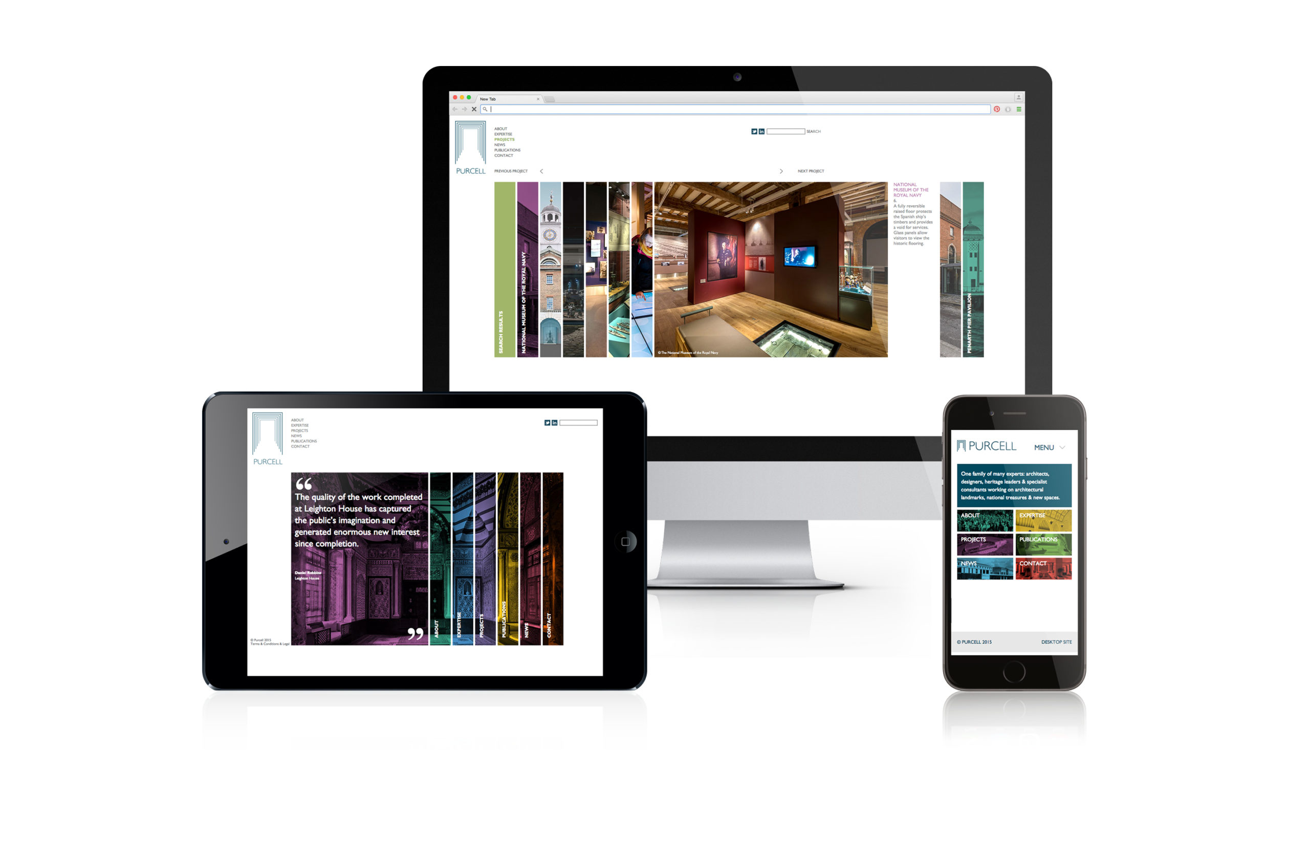
- Web design
- Word templates
-
£3.3mincrease in turnover
over 2 years -
75%bid success rate
-
18offices up from 12
in 2 years
-
£3.3mincrease in turnover
over 2 years -
75%bid success rate
-
18offices up from 12
in 2 years
