Temple Group
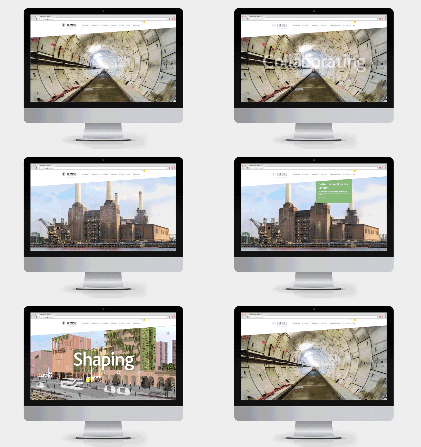
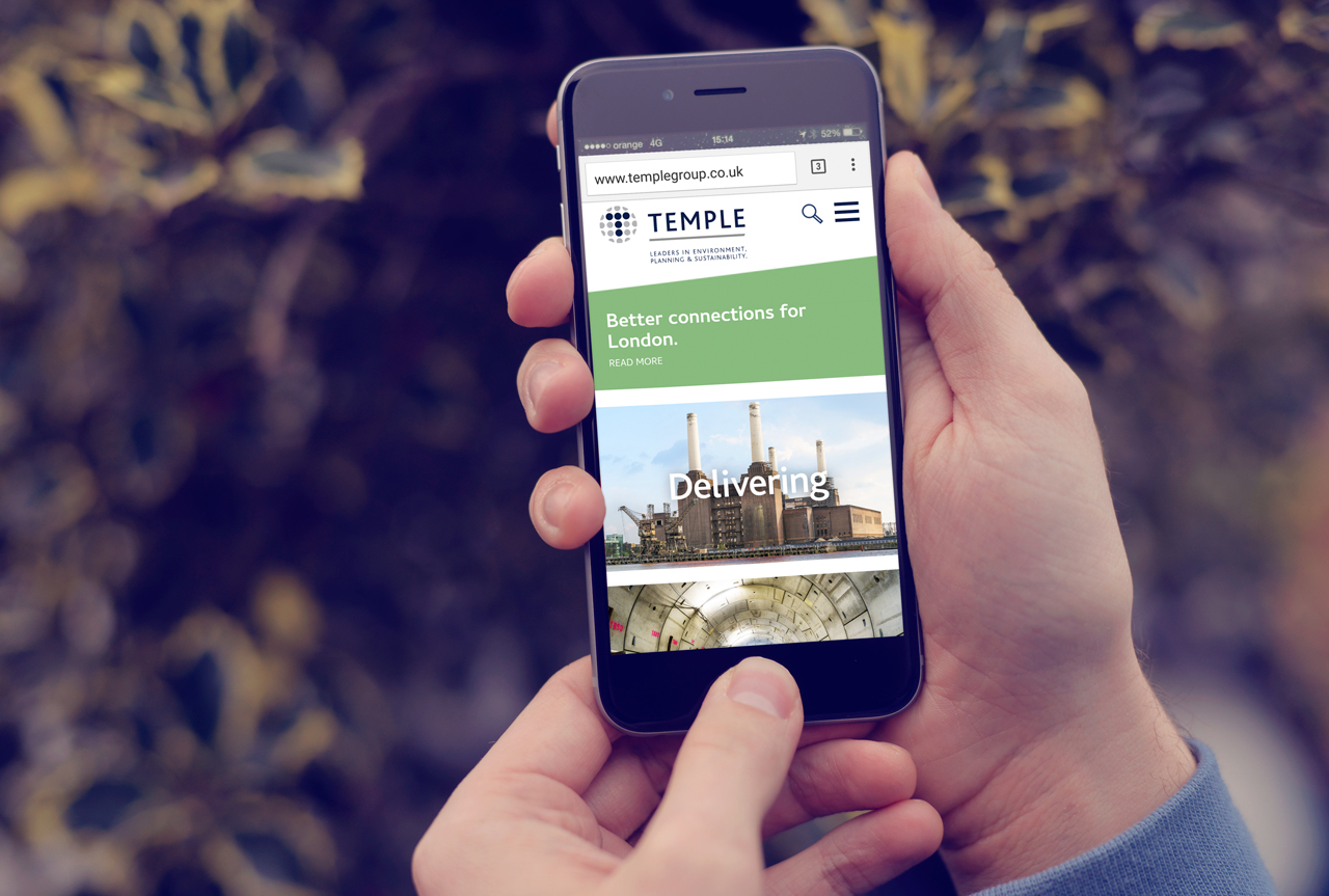
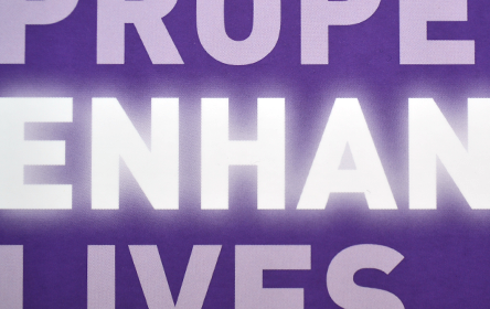
By building a clear brief to establish messaging and tone, the site features large animated panels of powerful imagery with dynamic words that form, representing projects that realise client ambitions by way of collaboration. To see the animated headers on their website please click here.
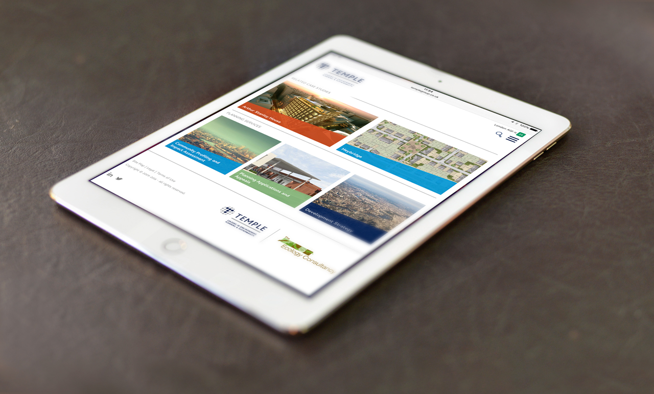
We felt strongly that their old site and indeed identity lacked modern environmental colours, so we expanded on their original unused colour palette, also bringing in fresher colours from their sister company’s palette, which now overlays images in a contemporary way. We also brought their ‘slant’ device into play, which was being used in literature but nowhere else.
Working closely with Temple, we helped curate their image library and advising them how to use dynamic images that capture the scale of the projects undertaken and that express their values and personality.
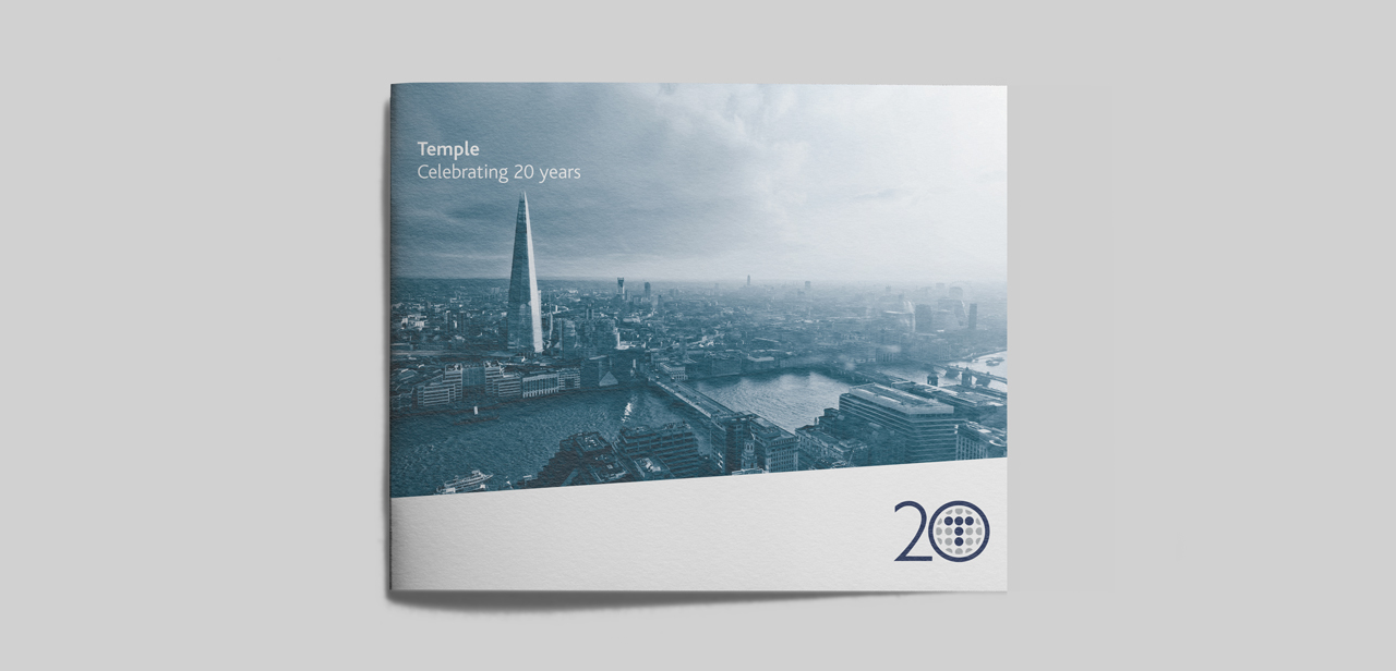
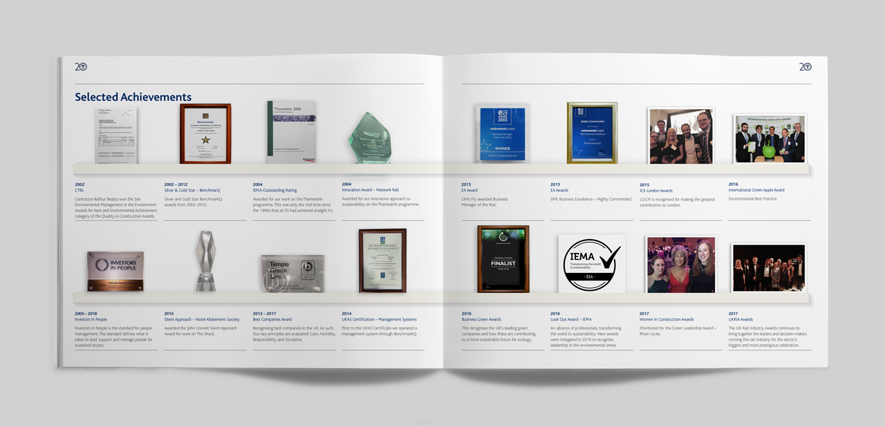
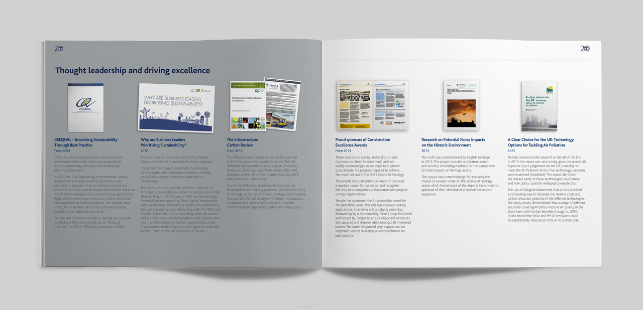
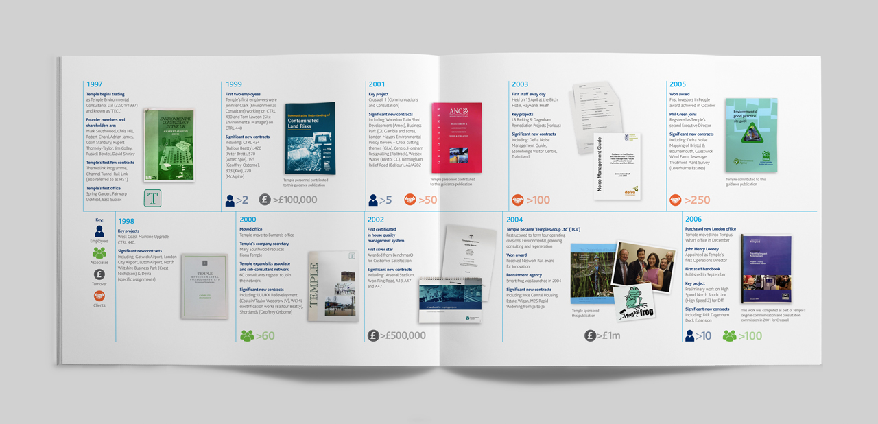
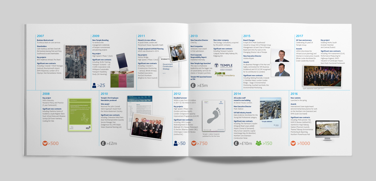
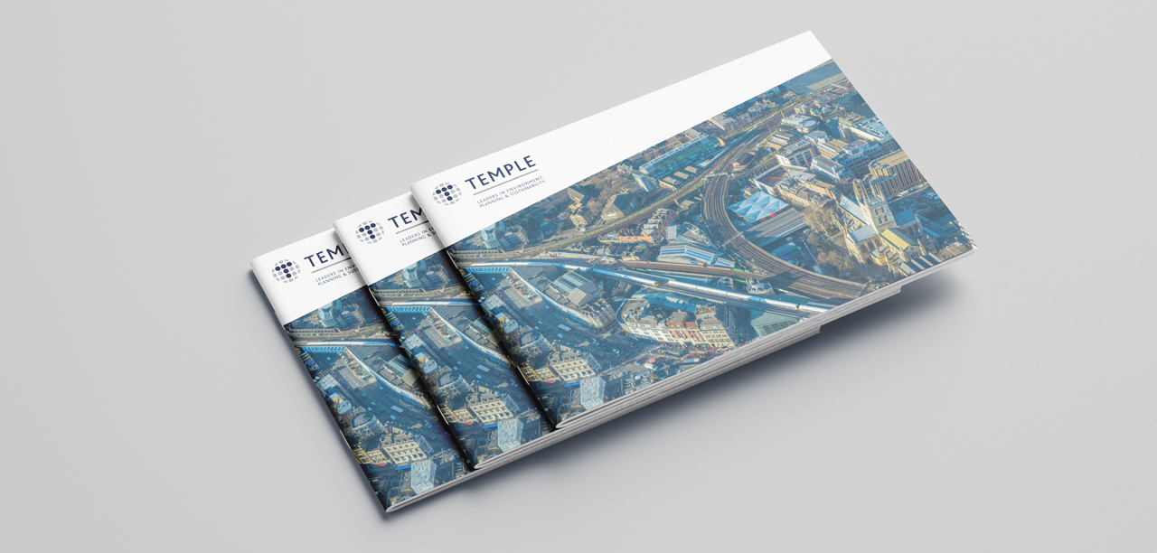
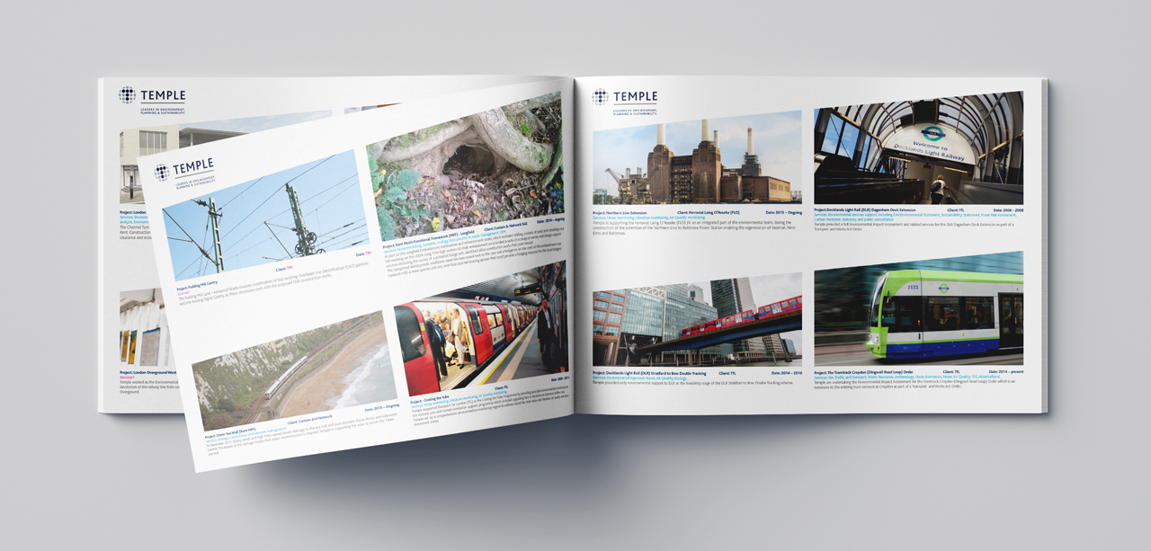
Our relationship continued into print, helping them develop a Rail sector document and leaflets.
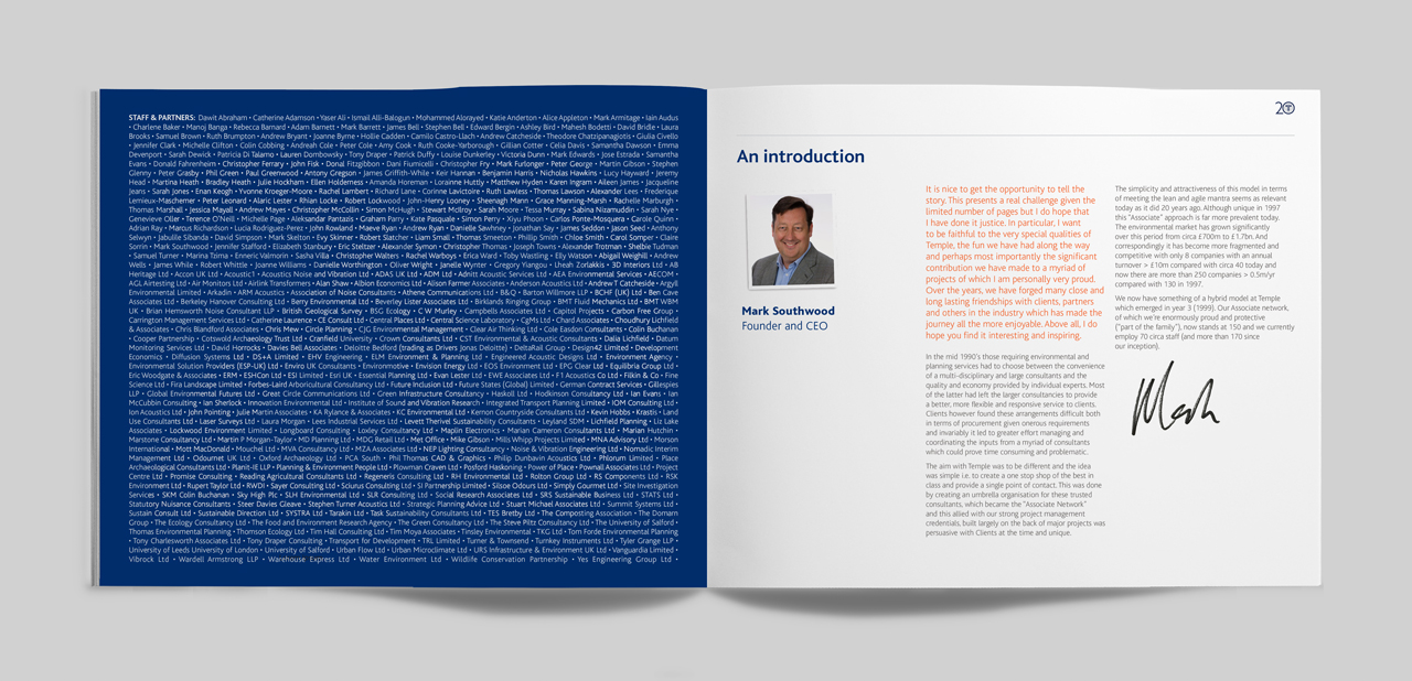
We also worked with Chairman of the Group Mark Southwood to develop the umbrella brand.
Most recently we have partnered with them to deliver a technical guidance document for their client TfL.
- Event graphics
- Literature
- Web design
-
57.5%website bounce rate reduction
after 4 weeks -
223users recorded (highest ever)
in one day
-
57.5%website bounce rate reduction
after 4 weeks -
223users recorded (highest ever)
in one day
