Terry Moore Design
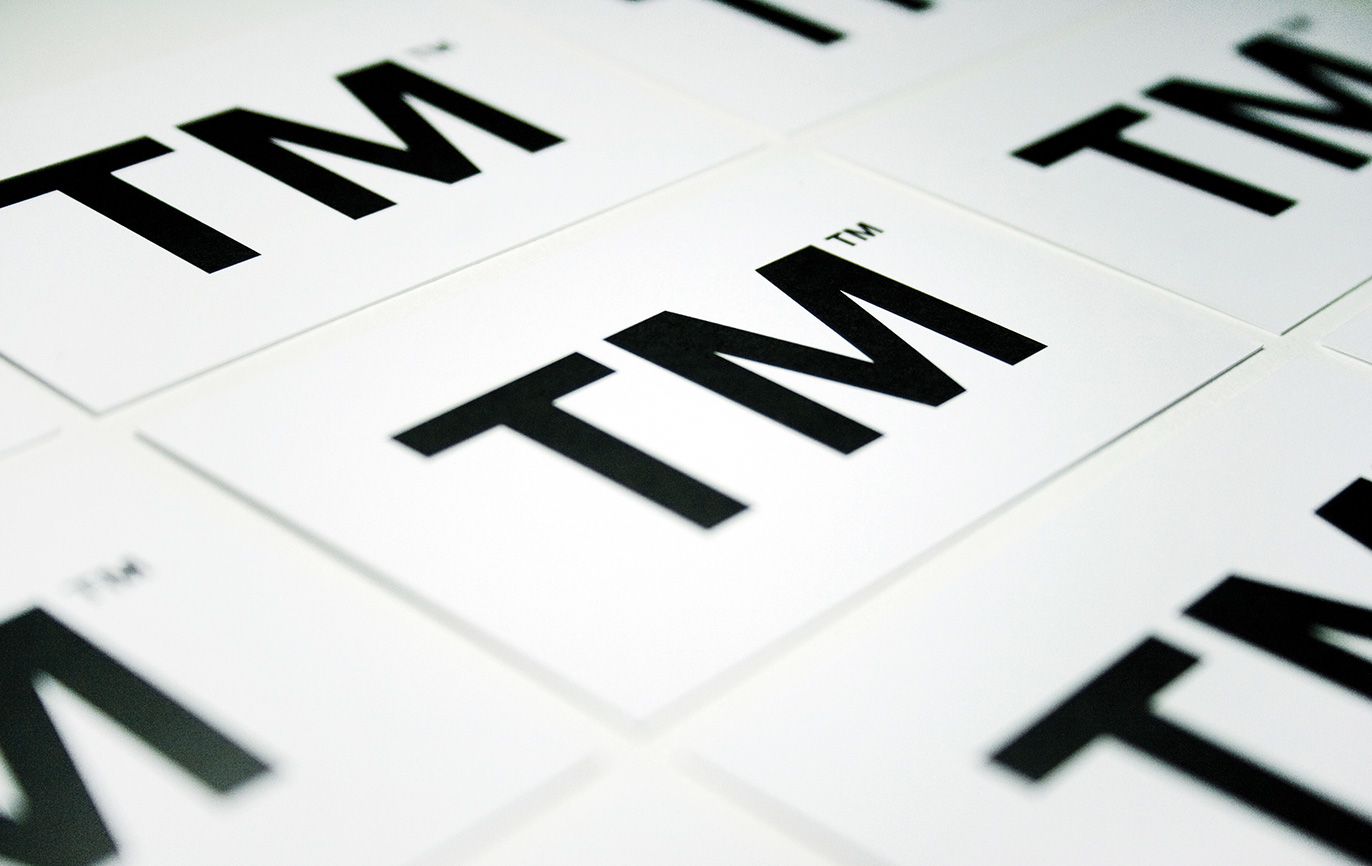
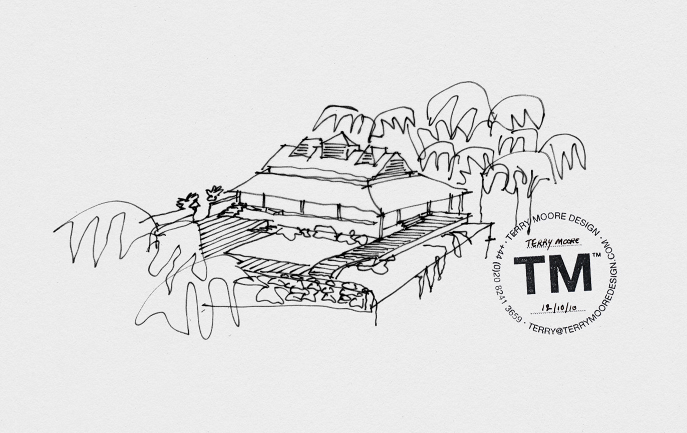
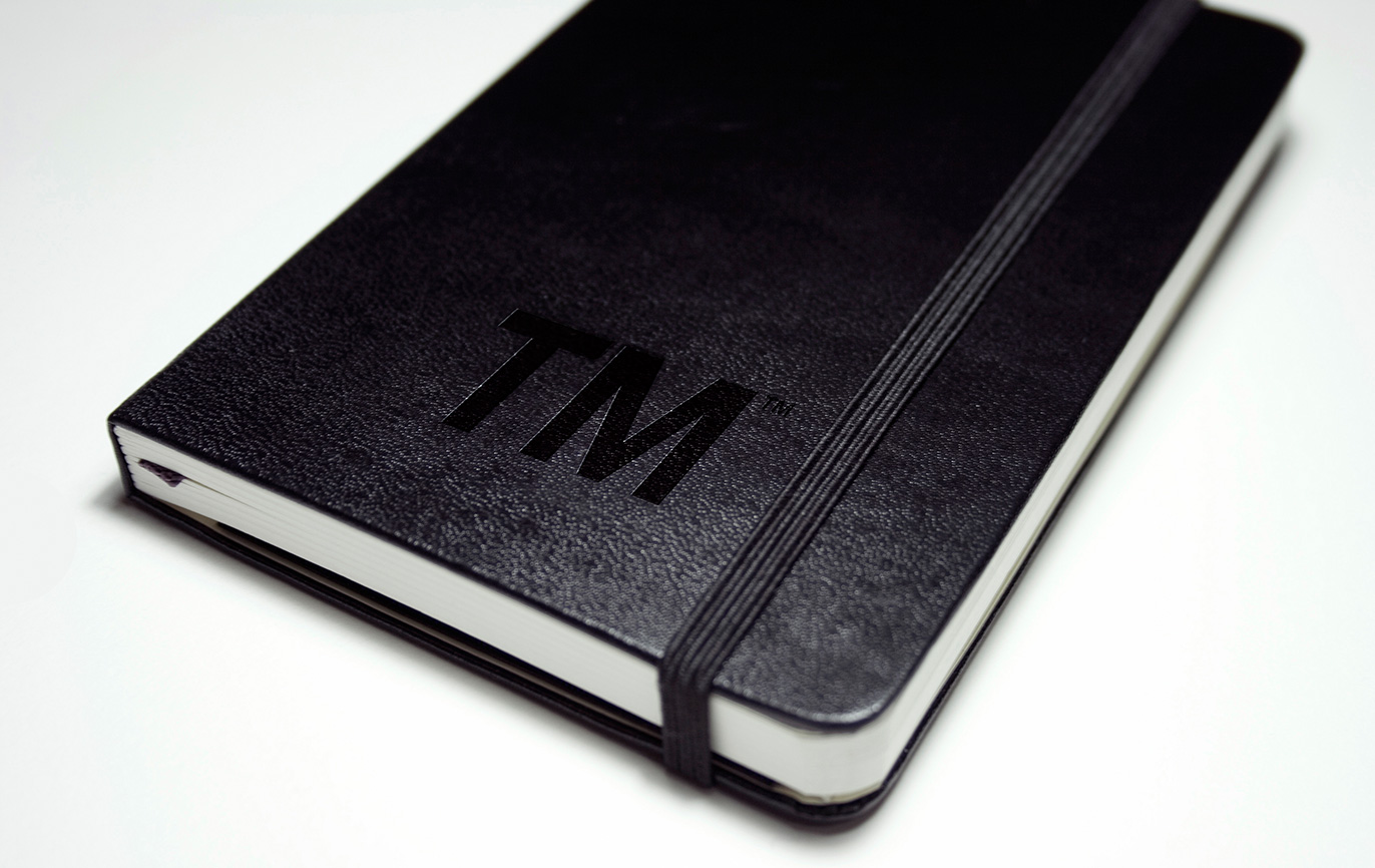
The solution couldn’t have been much more simple! We ‘trademarked’ his initials, which in itself looks like a trademark symbol. When stamped on his projects, it takes ownership of the creative work that he produces.
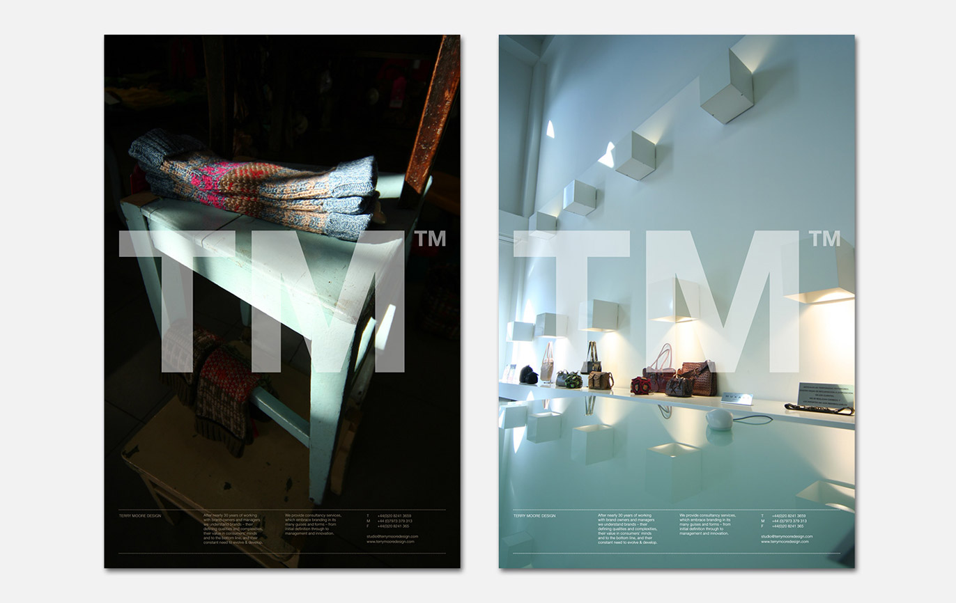
This confident use of the typographic logo became integral to his identity. His work is clean, simple and modern, exactly the approach we took.
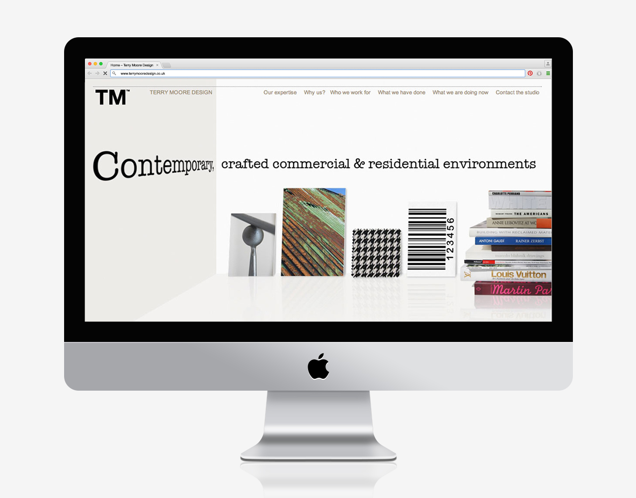
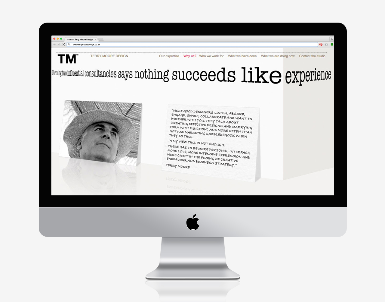
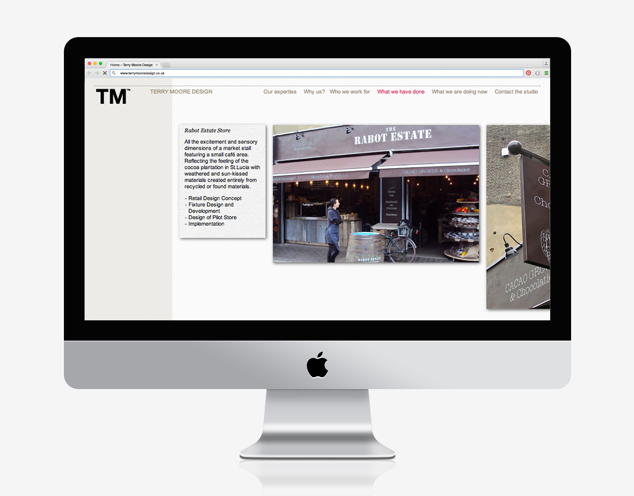
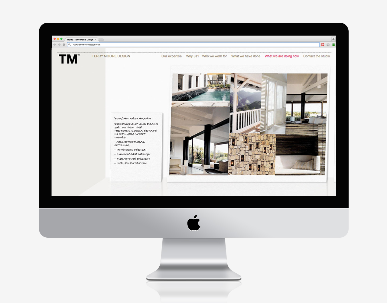
The website showcases current and completed projects as well as expressing his values and what drives him. The ideal backdrop for this was an interior environment, into which he could display finished projects mounted on the wall, or work-in-progress projects and thoughts, all controlled through WordPress.
Results
– Nominated for an award at the Blade Awards 2011
– Featured in Logotype by Michael Evamy
- Brand identity
- Brand strategy
- Campaigns
- Literature
- Powerpoint templates
- Stationery
- Web design
